Ubuntu AppIndicator (AKA Tray Icon)

EDIT: I copied this over to the GitHub because I hadn't realized that bug reports had moved there.

I recently discovered that I actually have a third-party Snap installation of Joplin installed on my system. In addition to the basics of Snap packaging, there seems to be one single difference between the Snap version and the official version, namely changes to joplin.desktop that allow Joplin to properly display its AppIndicator (AKA "tray icon") on Ubuntu. You can view the changes here:

This specifically fixes the bug referenced in the Joplin code here:

The link in the code suggests there's a fix:

I did some further digging online, and StartupWMClass=Joplin and XDG_CURRENT_DESKTOP=Unity appear to be two known workarounds for the AppIndicator not working in Ubuntu.

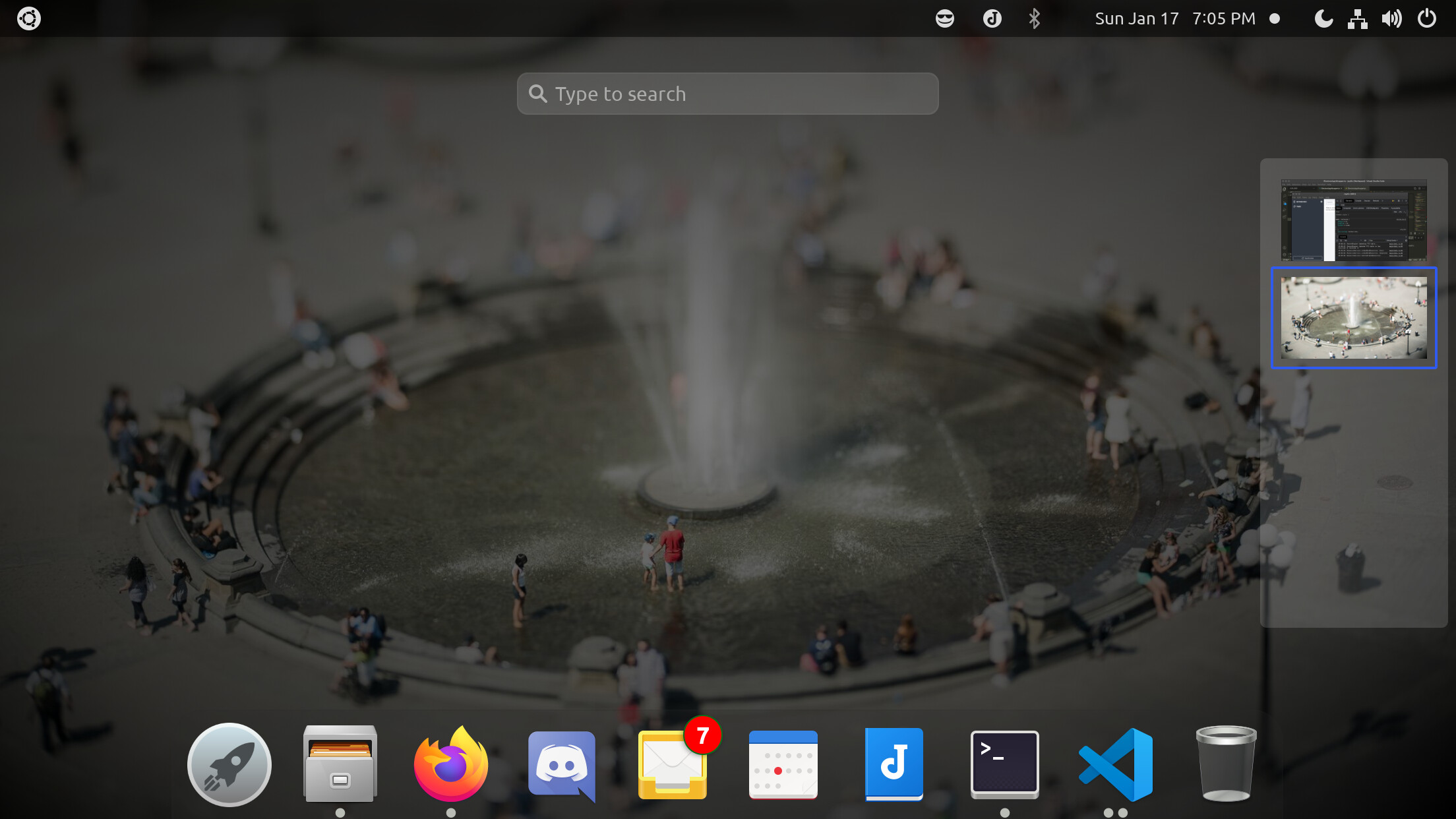
The main reason I discovered that Joplin's official distribution doesn't support the AppIndicator is that the AppIndicator for the Snap version is full-color, standing out from and kind of clashing with the monochrome AppIndicator icons adjacent to it:

GNOME tray

I guess my questions are as follows:

  1. Could the AppIndicator fix from the Snap be integrated into the official Joplin distribution?
  2. Could the AppIndicator icon on Linux (or at least Ubuntu, idk about other distros) be changed to use the same resource as the Menu Bar icon on macOS?

macOS Tray

Note: this function appears to be where it happens:

And,

  1. Though this is kind of off-topic, would it feasible or realistic for Joplin to have an official Snap and/or Flatpak/Flathub distribution? (Having both would be ideal because different Linux distros have different preferred "app stores"; Ubuntu, for example only ships with Snap, and Flathub must be added manually.)

FWIW the Menu Bar icon also seems slightly out of scale with its neighbors on Big Sur, though this problem also affects Nextcloud Desktop:

(If you figure out the icon scaling issue, I might suggest the same fix over at Nextcloud.)

Thanks!

1 Like

It's been a while, but from what I remember adding the actual StartupWMClass line wasn't the magic fix for the snap. Joplin at the time was setting its X11 Class properly, the line was added for redundancy. The Unity 7 line was what made the initial progress there since it enabled Joplin to use the DBus approach Electron 7 used at the time to get app trays working.

Specifically, Joplin didn't use AppIndicator again until Joplin 1.4, I.E this commit for the snap Support libappindicator for system tray icons · MrCarroll/joplin-snap@2b7c238 · GitHub. It probably was used in the past, but it certainly wasn't using it for a significant portion of 2020 (I imagine Laurent knows when Joplin originally transitioned to Electron 7).

I can take a look and see if I can improve the AppIndicator icon itself, I imagine it's just using the same icon as in the AppDrawer, there might be a way to adjust it on my end.

1 Like

Thanks! I actually linked to the function in ElectronAppWrapper.ts that seems to be responsible for the AppIndicator icon being different from the macOS one.

Line 270 could be replaced with...

if (process.platform === 'darwin' || process.platform === 'linux') {

...for Joplin to use the macOS icon on Linux. That said, some Linux distros seemingly prefer high-resolution color AppIndicator icons, but Electron is hardcoded to resize any larger icon down to 22px. That said, the icon would probably be slightly sharper if the image was 22x22 rather than 16x16. And I don't know how macOS does scaling for Menu Bar icons, but it presumably scales down from a higher resolution. So it might be better to specify separate "tray" icons for Linux and macOS.

I forced the MacOS icon on Ubuntu 20.04, it ends up looking like this.

Untitled

I agree that the default icon ends up looking out of place, but the MacOS icon ends up lacking so much contrast with the theme it could end up being invisible on certain monitors, maybe other environments would fare better such as by having a transparent task bar like the MacOS screenshot, but as is with Ubuntu being the biggest distribution and thus default, there'd probably need to be another icon instead.

2 Likes

Thanks for giving this a try!

I believe the reason the image appears black on Ubuntu and white (or black) on macOS is that macOS automatically inverts the colors of "template" images when they are used in Dark Mode. Template images are defined as monochrome images with an alpha channel:

https://developer.apple.com/documentation/appkit/nsimage/1520017-template

If Ubuntu is safely assumed to use a dark top bar, it could probably use a preemptively inverted version of the macOS image. (Note: I use Ubuntu.) If that cannot be safely assumed, then perhaps the AppIndicator icon could be automatically switched out with an inverted version based on whether Ubuntu is using a dark or light theme. (The same could probably work with Windows, but I don't use Windows, so I can't test that.)

There are two Electron functions which could be applicable to the color of the notification area:

systemPreferences.isDarkMode(), which is deprecated and may or may not work:

and nativeTheme.shouldUseDarkColors(), which is preferred but which only tells you the application's preferred color scheme:

IMHO the double-line edge around the macOS notification-area icon looks a bit busy at that scale and could probably be simplified. I'm not sure what the norm is on Linux, but two of the AppIndicator icons I have are circular, so that might look better. I can try creating an alternate version myself, but I probably won't get around to it today because I have a nasty cold.

If you want to try and use an existing asset, rather than creating an inverted version of the macOS template image, you could try JoblinIconBlack.svg, which ironically appears white:

You could also just try rendering JoplinIconBlack.svg at 22px, since apparently that's the fixed size of AppIndicator icons for Electron.

I should probably try and figure out setting up a Joplin dev environment on Ubuntu, since at the moment I just have one set up on macOS.

EDIT 1: Here are some symbolic icons based on templates from the GNOME Icon Development Kit (specifically because AppIndicators are a standard use case for GNOME symbolic icons):

joplin-book-symbolic joplin-circle-symbolic joplin-roundrect-symbolic

Note: GNOME should automatically set the fill colors, like macOS does with PNG "template" images. (The gray fill is just convention.) If it doesn't, here's a set that's pre-colored as white:

joplin-book-symbolic-white joplin-circle-symbolic-white joplin-roundrect-symbolic-white

And if for whatever reason Electron insists on using PNG images, here are rasterized exports of the above (at a higher resolution than necessary, since GNOME does downscale):

joplin-book-symbolic-white joplin-circle-symbolic-white joplin-roundrect-symbolic-white

IMHO the roundrect is probably the most legible at the size AppIndicators use on Ubuntu.

I can try and set up a Joplin development environment on my Ubuntu box so that I can test this myself.

EDIT 2: Electron unfortunately refuses to use SVG images for tray icons, so I ended up using PNG exports. Ubuntu seems to tint AppIndicator icons to 85%-luminance gray, so I tinted the PNGs to match. Here are the tinted icon files if you want to see if they look right on your computer (i.e. if you have a different theme than I do):

joplin-book-symbolic-gray joplin-circle-symbolic-gray joplin-roundrect-symbolic-gray

And here are screenshots with the above icons in context:


Because the tray icon for dev builds is also gray, my thought was that there could be a different colorway for these icons in, say, traffic-cone orange for that purpose. I can try and build Joplin on my Mac to see how these same PNGs (in black) look. And if you have a working Windows setup, you could check to see how these three tray icons look on there, too, and what color might work best as a default.

2 Likes

@james-carroll I don't know if you get notifications for edits rather than additional comments, so... pokes

Edits don't trigger a notification by the looks of it :slight_smile:

I think it's important to say that I'm not part of the official Joplin development team, I do have that snap and it has plenty of users, but otherwise I've the same influence as anybody else when it comes to design choices like this.

That said I like it. I've tried it locally and personally I think the rounded rectangle looks the best, particularly the first iteration without the tint. I can't exactly the describe it, the tinted versions on Ubuntu's defaults seemed to have better contrast, so identifying the J was easier, but the non-tinted versions just seemed to stand out more. On the technical side, I'm limited with what I can do with the snaps due to their sandboxing, I wouldn't even be sure if telling if the system was in dark mode would actually work reliably from system to system, so I'd veer on the preference of using the version that wasn't so specically targetted to a single systems default.

The circle looks good too, but I'd have to shy away with the J on the book icon, I think it'd be too easy to confuse users on whether the notebook was part of the official branding, so I'd rather the core devs made the call on that one. It's artistically fine, but Joplin is note(book) taking software afterall :stuck_out_tongue:

I haven't messed with themes on Linux myself in years. So I just installed KDE on Ubuntu instead, where the difference between the tinted circle and the untinted rectangle look like this.

I don't personally publish any dev builds of Joplin so I've no real input to offer on the dev builds icons.

And unfortunately I don't have a proper Windows testing environment so I can't be particularly helpful there, sorry.

However, as far as the snap itself goes, I'd personally be willing to use these icons if you'd allow it. In the specific context of Linux which is all I have to worry about, these match the general system theme much better and I doubt the core devs would have an issue with it. However I think it's probably worth trying to get their attention, because I reckon they'd be adopted upstream anyway!

1 Like

Thanks for getting back so quickly!

I've been playing around with icons recently, and the AppIndicator icons are just part of it. You can see some of my other mockups in this thread:

Regarding the tint, I went in with the eyedropper tool in your screenshots, and the other KDE tray icons are 94%-luminance gray. So they're not 100% white, either, but they're a slightly different tint. Electron not supporting SVG indicator icons seems to be an upstream problem with Chromium, so I was thinking of creating an issue on the chromium.org issue tracker. (EDIT: see here.) I would not be surprised if a proper SVG indicator icon ended up using the correct fill color on both GNOME Ubuntu and KDE.

On my open pull requests for the application icons, @laurent mentioned the lack of engagement here on the forum as a reason to hold off on approving them, so soliciting feedback from other users like you is an important part of the process (and indeed you can update GitHub pull requests with additional commits).

My thought for once I do a pull request for the tray icons in the main repository is that I will include the SVG for all three shapes but only use the plain square one in the build for the time being. The book icon I did in part because I made some book icons in the other thread, as well.

Here are the icons on macOS:


It turns out that, unlike on Linux, where Electron scales AppIndicator icons to a fixed size, on macOS Electron leaves them pixel-perfect, with the only option being 2x pixel density. The icons would probably also look slightly sharper if the vector drawing fit more closely to the pixel grid, though this is mostly noticeable with the book and with the "J" glyph.

In each of the images, the icon is 28px x 28px, but this could be changed if a slightly different size looked better. Note that the Emoji Palette icon to the right of the Joplin icon is 30px x 24px, and the Time Machine icon to the right of that is 32px x 26px.

Any further thoughts?