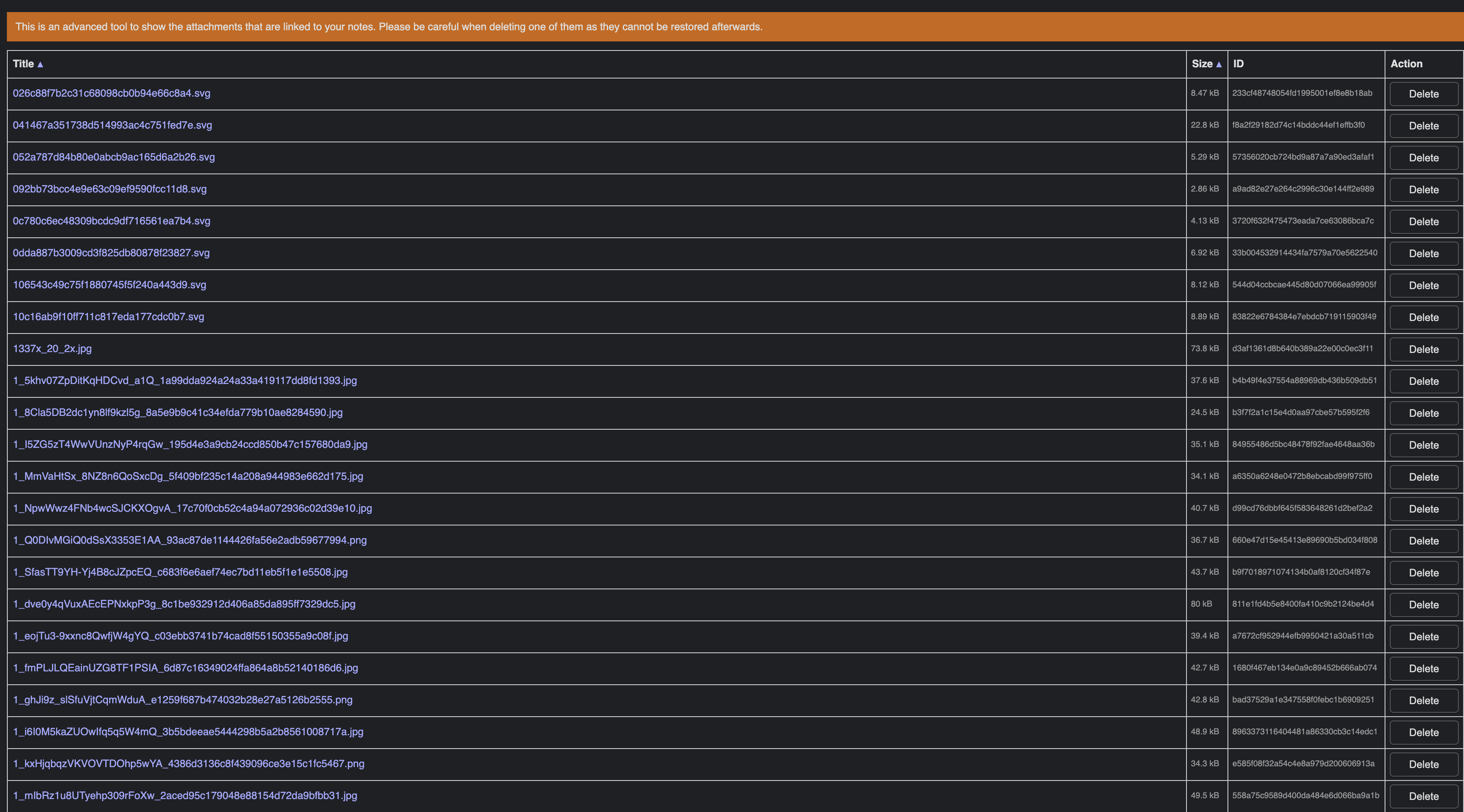
The text is hardly readable. While I undestand that other columns are not that important, size certainly does not fit that criterium. After all, we can sort by size, which means it is a rather important metric.
I played around with the dev tools and without a font-size element for the first 3 columns the table looks much better:
(Please note that the images are bigger than they are actually displayed on the screen.)
Too bad that we don't have classes for the column cells, in which case it would be very easy to change the size. There are in fact several elements that would benefit from a class. I've created a topic upon your request: List of CSS elements which should have a class
The item is already in the menu Tools, thus it shoud be obvious that it is a tool. ![]()
But in the screen above the table, we could add a centered big title like Attachment Manager.