The screen for the resources has been changed and here are a few observations:
- the menu item was changed from
Resources to Note attachments. Why?
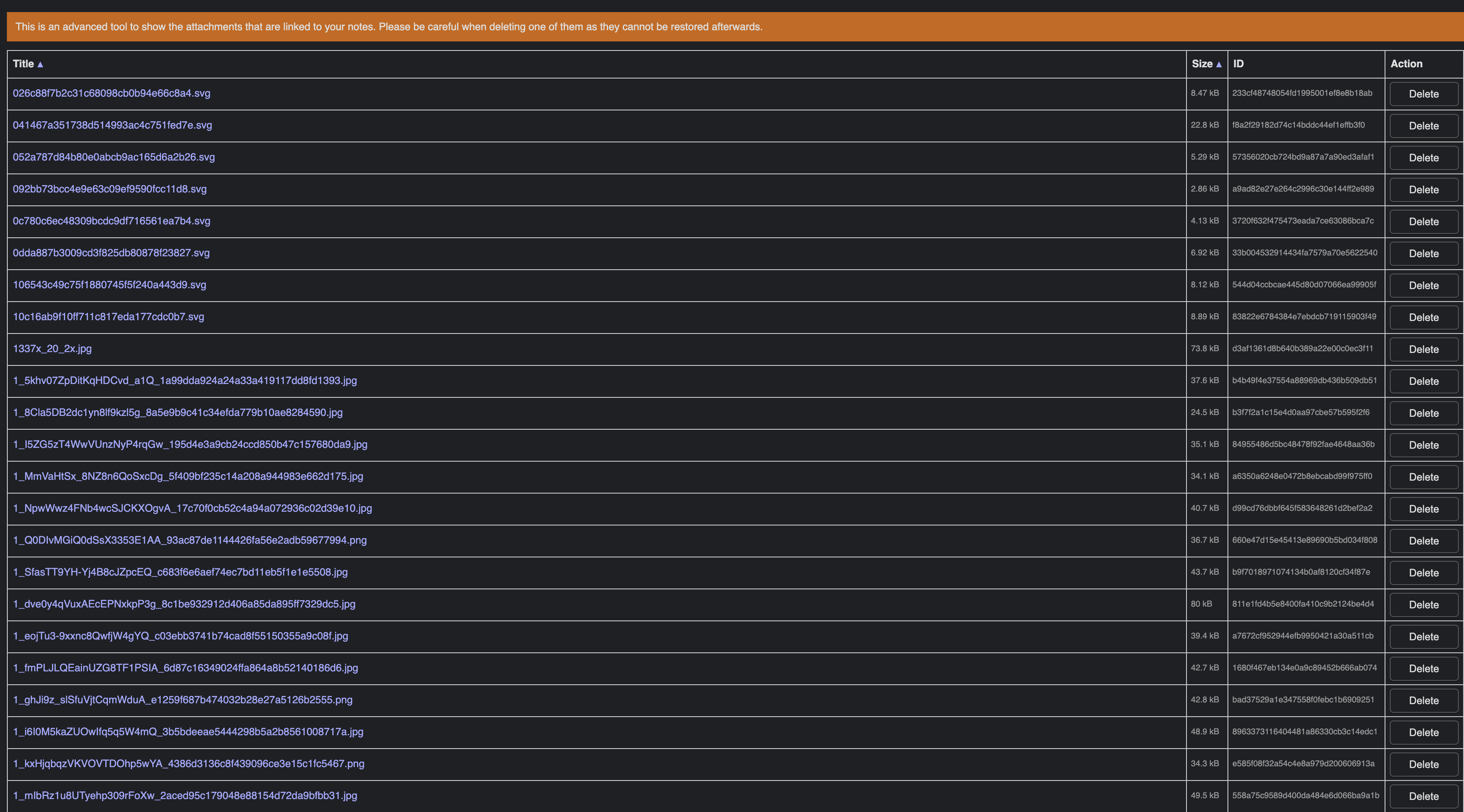
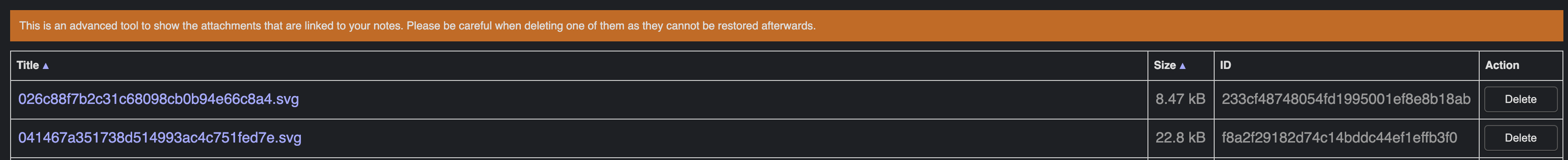
- the font is so small that one can hardly read the title and size.
The font size for the title is 12px and for the size column is 9.6px. Why is the the font-size set at all?
It looks much better without a font size set and as a big bonus - one can read the text.
Any chance we could remove the font-size from that table?
1 Like
I know that the menu item was changed as it was given in the spec sheet by Laurent.
Also, I can’t view the new resource screen. I’ve noticed that the .tsx is not compiled to .js on doing npm start. Am I missing something?
In the UI, we use the term "attachment", not "resource".
Also, I can’t view the new resource screen. I’ve noticed that the .tsx is not compiled to .js on doing npm start . Am I missing something?
On macOS and Linux you need to have npm run watch running for TypeScript files to be compiled.
1 Like
Since now we have a scroll bar, I think that would be nice if the table header was freezed on top of the page and also have the mime type and filename fields displayed.
Other wish is to be able to search or filter the resources. Till now I couldn’t find a way to do that.
Ok, that explains it. However, Note attachments... sounds a bit off. The term 'note' is redundant. To what else should a resource be attached?
Well, apart from the menu item, the font is way too small. So here's my questions again:
The font size for the title is 12px and for the size column is 9.6px. Why is the the font-size set at all?
It looks much better without a font size set and as a big bonus - one can read the text.
Any chance we could remove the font-size from that table?
1 Like
Yes maybe just Attachements… would be better. Or “Attachment manager…”? Not sure how to best express that it’s a tool for attachments.
What do you mean about the font size? 12px is the default we use everywhere, and the other fields are smaller, because less important. I guess we could make them the normal size too, but I don’t see the issue with 12px
The text is hardly readable. While I undestand that other columns are not that important, size certainly does not fit that criterium. After all, we can sort by size, which means it is a rather important metric.
I played around with the dev tools and without a font-size element for the first 3 columns the table looks much better:
(Please note that the images are bigger than they are actually displayed on the screen.)
Too bad that we don't have classes for the column cells, in which case it would be very easy to change the size. There are in fact several elements that would benefit from a class. I've created a topic upon your request: List of CSS elements which should have a class
The item is already in the menu Tools, thus it shoud be obvious that it is a tool. 
But in the screen above the table, we could add a centered big title like Attachment Manager.