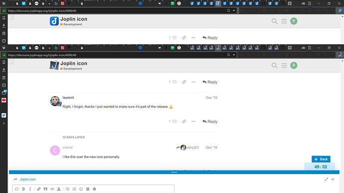
I like the blue paperclip icon! That looks sharp
I do agree with Laurent that the two stickies look a bit too simplistic. Had I seen that in an app store, I would just keep scrolling past.
Good job!
Hey, bad timing, but nothing is forever. File it away for the next time the UI gets a refresh.
That looks nice!
Aaargh. Ever since the forum icon changed, I've checked for updates to the app like a hundred times! 
Not sure when the next release is planned.
Well yeah, I get that it's not exactly a high-priority issue. 
I'm hoping this weekend, I'd like to see the icons updated too  By the way, @tessus I seem to remember you've also updated the resource icon. Did that go in one of the pull requests?
No, you allowed me to push it directly:
Right, I forgot, thanks I just wanted to make sure it's part of the release 
I like this over the new icon personally.
I do not.
I agree with Laurent
Laurent’s point is clear: He doesn’t want to limit the impression and future development of Joplin in the minds of users.
Joplin is ambitious software that implements many functions and is no longer a very specific software.
Joplin has a super powerful Web Clipper that achieves a combination of web pages and notes in a way I never imagined.
Before encountering Joplin, if I wanted to save a webpage, I could only copy and paste it into Typora, or print it to PDF, or use services such as Pocket, but either way, there are disadvantages.
But Joplin’s own concept made me feel relieved. The compatibility of open source, local storage, data in my hands, and saving web pages is very good.
Joplin has become my best partner in my mind!
I use Joplin for notes, memos, to-do lists, file organization (backup and organize files independently using attachment functions, such as software and plug-ins, materials and results, etc.), web page backup, journal.
The author’s new icon is well-designed, but the concept may be different from the Joplin concept. This icon has very strong functional orientation. Two papers and a paper clip variant give a very fixed impression. It is a note.
software?
If the user is impressed with this, then the user may not be interested in learning about Joplin’s Web Clipper or other great features, which is a disaster for Joplin.
In addition, I do n’t know if the author tests the recognition of the new icon in more scenes. Joplin ’s icon is not only a software icon, but also applied to web page labels, avatar identification, etc.
Tested and found that the recognition is not as good as the current icon, and the two icons will know which one is better in the actual use scene.
Therefore, I suggest that you can continue to optimize the icon, share it on the forum, let interested users download it by themselves, and change their Joplin icon on the computer.
The design is great, but it is not suitable for the application scenarios with many Joplin icons.
A / B test shows us clearly, which one should be a suitable icon
As someone that really likes Joplin allow me to give my opinion.
I may be wrong but, by what I understand from Joplin it is an aggregator of notes (being them either plain notes, to-dos, web-clippers, attachments and so on).
I really believe that a paperclip with papers represents the core functionality of the project. How it syncs stuff and communicate with other software is not the heart of the application (these are the features, not the core functionality), how it aggregates notes is.
Take Gmail as an example, it has a huge number of integrations - calendar, notes, hangout, etc. You can do a lot of stuff from you e-mail web application, but its icon is an envelop, which reflects its core functionality, sending mail.
And if Joplin at some points lose focus and starts being more than this (an aggregator), maybe a change of icon will be required anyway.
Poto mentioned
And later
It is a concept! You don't take concepts literally, Gmail doesn't send actually envelops, save buttons doesn't actually use floppy disks, any modern day internet user can understand concepts behind good icons! And by the way, a Web Clipper stores data from a web Page, the concept couldn't make more sense than this, a paperclip with pages!
That being said, I really find the icon presented here better than the current one. There may be room for improvement (as there always is) but, I believe the arguments presented against the new icon are weak.
Anyway, thank everyone for the good work. And the passion we see here for the project is something very positive.
