Hello everybody,
while using Joplin during the last years I came across some minor UI inconsistencies. Depending on the context and affordance of an element styling should be and must be different, but I think this is not the case for the examples below. Each one by itself is minor but I think that fixing them would make the experience of using Joplin more coherent (especially for new users).
The screenshots in the following will be in German because I forgot to switch the language, but I think you will be able to recognise all elements. I am only talking about the desktop UI, not the mobile apps.
I did not create issues on GitHub because I am not sure if these changes are considered bugs. I am happy to create detailed issues on GitHub if requested. I have no real experience with React (Native), so I am not sure how easy or difficult it is to unify the design.
Modals/Popups/Dialogs
Call it whatever you want, but depending on the feature the dialog is inconsistent. The none-system dialogs might benefit from some box shadow for visual depth and perhaps the possibility to click the backdrop to dismiss (depends on the context).
The alarm and go-to are similar:
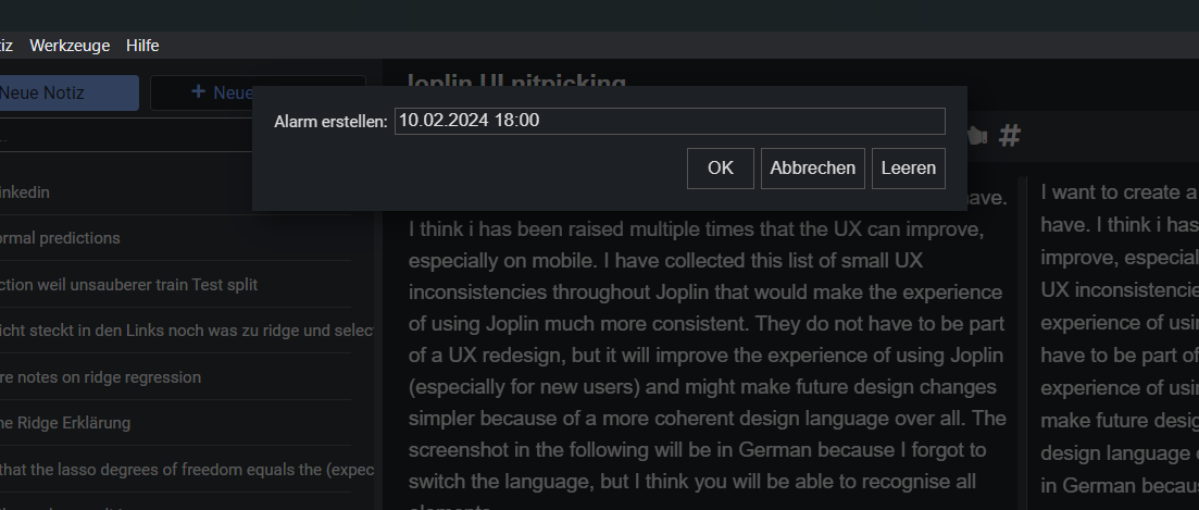
The sync assistant or the "Create Notebook" dialogs have rounded borders and buttons are styled different. Moreover the modal header and footer have a dark background colour while the the content has a lighter colour.

If I renew the web clipper token I get a default systems dialog:

Additionally there are the system dialog elements which do not use system dialog buttons e.g. removing a tag or a note.

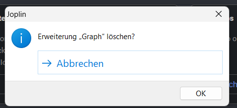
Finally the "Remove plugin" dialog is a mix of both:
On a more general note, it always confuses me that, the settings, the sync status and the attachments overview replace the whole application view. As a result the menu bar is replaced and I have to find the "back" button to go back to my notes.
Spacing and Sizing
If you look at different buttons and input elements in the interface the padding/spacing is all over the place. Because of that the UI looks more inconsistent than it actually is. Also the border radius in different items seems inconsistent, e.g. between buttons and while hovering editor styling settings.
Please compare the inner spacing of the "order by" icon with the inner spacing of the synchronise button. The order icon is nearly touching the border. The synchronise icon or the search placeholder text does not. The richtext <-> markdown editor switch looks different again (not pictured).

If you look into the note properties input elements have a different inner padding and no border-radius.

Looking at the icons I am not sure if they come from different icon sets, just have different stroke width or if it just different padding, but they do not look 100% coherent. I am not able to say clearly what irritates my here. I have to do some more digging.
Context Menus
Joplin's menus (context menus and menu bar) do not follow the OSes default styling. Joplin is a React app, so it will not look 100% native, but if you look at the list below the difference is clearly visible. Joplin uses full width background colour on hover, while each OS uses a "pill" style.
- Joplin:
- Windows:
- Apple:
- GNOME:


GNOME and Apple images are taken from the respective human interface guidelines.