Thanks, man! Appreciate it!
I like so much the aesthetics and functionality of the Things 3, i just don’t use it cause i don’t really have any Apple device here, but i’m glad i could make it a little bit close to it.
Thanks again for adding!
Thanks, man! Appreciate it!
I like so much the aesthetics and functionality of the Things 3, i just don’t use it cause i don’t really have any Apple device here, but i’m glad i could make it a little bit close to it.
Thanks again for adding!
Please, can you share code for this look (icons and all elements).
Sorry @omega3,
The latest release Joplin with latest release of Amanda's dark theme it just looks like this
My little tweaks to get double sized icons in the primary color, do not seem to work anymore. I am (gladly) not a CSS specialist, so you will have to figure it out yourself or ask Amanda to help you out.
Cheers,
Lourens
Hmm, looks like the icons each have different classes now, would take some work to find them all. For example, the alarm now has a custom . icon-alarm class instead of a .fas class (used to be used for all icons).
I plan to do some work on my theme at some point to make a dark version of the new theme, but have been using the base theme for a couple weeks to see what tweaks are helpful.
Has anyone had any luck changing the color of inline code blocks (in md editor) while using dark theme?
It's trivial with light theme, just need:
.cm-comment {
  color: var(--inline-code) !important;
}
In dark theme they also get class .cm-s-material-darker, but targetting this doesn't work. It looks like first they get styled by material-darker.css:
.cm-s-material-darker .cm-comment {
  color: #545454;
}
Which is then overridden by the main stylesheet, under <style id="codemirrorStyle">:
.cm-s-material-darker span.cm-comment {
	color: #878787 !important;
}
Which also overrides anything in userchrome.css...
Is there a way to work around this? It seems like userchrome.css is being read before the other stylesheet which overrides since they have same importance.
Maybe removing this from material-darker.css completely would allow !important to be removed, making user customization possible again?
Try adding:
[class^="icon-"], [class*=" icon-"]{
font-size: 24px !important
}
Didn't notice that the first time around, but I think that will change all of them.
I read that a more specifically stated element can override a previous, but less specific, element's !important
I tried the below and the code text changed to red in the dark theme. However you may want to give it a bit more testing to ensure it works in all situations.
pre.CodeMirror-line span[role="presentation"] span.cm-comment {
	/* code text - dark theme override*/
	 color: red !important;
}
Thanks so much! I flipped through a bunch of existing notes and haven't found any problems. Definitely going to try this approach on some other issues.
This is an extremely simple modification of the Dark Mode CSS to eliminate outlines on everything for a "flat" look:
/* Remove Borders on Everything */

div, input, a, button, select, div::before {
	border: 0px !important;
}

/* Fix Input Mode Toolbar Item To Work Without Border */

.tox-tbtn div {
	height: 26px !important;
	border-radius: 4px !important;
}

.fab {
	top: 5px !important;
	font-size: 17px !important;
}

.fas {
	top: 5px !important;
	font-size: 15px !important;
}

/* Make Input and Select Elements the Same Height as Buttons */

input, select {
	height: 26px !important;
}

/* Use Alternating Row Colors In Note List */

.note-list .list-item-container:nth-child(even) {
	background-color: #26282e !important;
}
The alternating row colors only work with Solarized Dark for the time being. Somebody mentioned having a CSS color scheme specific to macOS, and I would really like to be able to use that instead!
Big Sur seems to use very subtle transparency for tinting. I looked into it, and Electron requires an API call for window transparency, so it can't be done with CSS alone. An additional advantage with window transparency is that perhaps the window wouldn't appear solid white while the application is loading.
Great work! The alternating colors is actually working fine for me on regular dark theme too.
Sorry, my mistake. I meant the default dark theme, which I thought was Solarized Dark but apparently isn't. The default dark theme has a bluish undertone, too, just not as bluish as Solarized Dark does. (It isn't a completely neutral gray.)
Amanda,
Sorry for late reply, as always perfect fix!
For @omega3,
combined with setting them to primary color it is
[class^="icon-"], [class*=" icon-"]{
	font-size: 24px !important;
	color: var(--primary) !important;
}
but what is
var(--primary)
What it I want #3399ff color?
Just doing
color: #3399ff !important;
doesn't work.
var(--primary) is a CSS variable and would need to be defined elsewhere in your file, but you are on the right track with just using color: #3399ff !important;. I just tried adding this to userchrome.css:
[class^="icon-"], [class*=" icon-"]{
	font-size: 24px !important;
	color: #3399ff !important;
}
and got
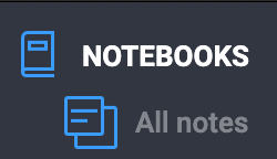
In looking through, there are still a few icons that aren't in this set, but it covers 80% of them.
If you want to make the user interface use the system font (instead of Roboto), try this (both font-family and font are required):
div, input, a, button, select {
    font-family: sans-serif !important;
    font: caption !important;
}
(via Viljami Salminen)
I added a background to the sync button to make it more visible with this, also does hover highlighting:
Edit: This approach is unreliable, improved version here.
/* Add button background */
.gmYgTL {
  background-color: #25282E !important;
  border-radius: 16px !important;
  width: 85% !important;
  margin-left: 7.5% !important;
}

/* Outline on hover */
.gmYgTL:hover {
  border: 1px solid #0097DB !important;
  border-radius: 16px !important;
}

/* Prevent text color changing on hover */
.sc-AxgMl {
  color: #FFFFFF !important;
}
Example:

Hover:

Be careful using those "random-style" css classes like .gmYgTL and possibly .sc-AxgMl. It seems that the class names can change between Joplin versions. So you could upgrade Joplin and this would stop working. You would then have to find the new names for those classes and edit your userchrome.css. You would then have to do the same after the next upgrade and the next etc.
It would also mean that someone not using the same Joplin version as yourself could not use this.
@laurent 's suggestion (see link) is to stick to using "traditional" selectors for a better chance of version to version stability.
Ahh good catch, thanks for the link! I had wondered where all those random names came from. Was using them in a couple other places too, that would have been a pain to fix.
Fortunately it was pretty easy to correct with the "copy selector" trick in developer tools:
Edit: This approach is unreliable, improved version here.
/* --- SYNC BUTTON --- */

/* Add button background */
#react-root > div > div > div.resizableLayoutItem.rli-root > div.resizableLayoutItem.rli-sidebarColumn > div > div > div:nth-child(2) > button {
  background-color: #25282E !important;
  border-radius: 16px !important;
  width: 85% !important;
  margin-left: 7.5% !important;
}

/* Outline on hover */
#react-root > div > div > div.resizableLayoutItem.rli-root > div.resizableLayoutItem.rli-sidebarColumn > div > div > div:nth-child(2) > button:hover {
  border: 1px solid #0097DB !important;
  border-radius: 16px !important;
}

/* Prevent text color changing on hover */
#react-root > div > div > div.resizableLayoutItem.rli-root > div.resizableLayoutItem.rli-sidebarColumn > div > div > div:nth-child(2) > button > span.sc-AxgMl.kXAnQF {
  color: #FFFFFF !important;
}
Something very strange is going on. None of the selectors work. I also had my own selectors and they don't work either.
That is odd, they worked for me using v1.2.6.
However I noticed that the last selector still cites "random" class names.
I have tried minimising the selectors @jamedeus found by working down from div.side-bar and came up with this:
/* --- SYNC BUTTON --- */

/* Add button background, add rounded corners, reduce width & then centre*/
div.side-bar > div > button {
  background-color: #25282E !important;
  border-radius: 16px !important;
  width: 85% !important;
  margin-left: 7.5% !important;
}

/* Outline colour change on hover */
div.side-bar > div > button:hover {
  border: 1px solid #0097DB !important;
  border-radius: 16px !important;
}

/* Prevent button text color changing on hover */
div.side-bar > div > button > span {
  color: #FFFFFF !important;
}
Any better luck getting the sync button to change with this?
EDIT: or are you referring to every selector not working now in your css file? That often happens to me when I have accidentally missed a ; somewhere or have an unmatched number of { }.
