Well I'm thoroughly confused at this point. Initially I was certain it didn't work because I had removed the "All notes" div (top of sidebar) before I found those selectors, which all use nth-child. I restored "All notes" expecting that to increment everything and break the sync button, but it didn't. Then I removed my whole userchrome.css and tried the lines I posted on vanilla Joplin... which also worked. Honestly have no idea, maybe it somehow conflicts with other custom CSS?
As for your other selectors, they didn't work for me either but I was able to fix it by changing the first nth-child:
#react-root > div > div > div:nth-child(1) > div:nth-child(2) > table > tbody > tr > td.titleCell,
#react-root > div > div > div:nth-child(1) > div:nth-child(2) > table > tbody > tr > td:nth-child(2) {
  font-size: unset !important;
}
Don't know react so I also have no idea why this works, but it does! Maybe someone who actually knows what they're doing (@dpoulton?) can make it more robust .
I have never ventured before into the css there! Looking at your css and the css around the data you want to change, it seems that td.titleCell and td.dataCell are unique classes that can be manipulated. So ...
... unsets the font size. HOWEVER this works for the entire row because the resource ID is also td.dataCell.
I have browsed through Joplin's screens to see if the classes are used elsewhere and so far I have not found any unexpected changes in other areas of the interface.
Add Generic Icons to Sidebar Notebook and Tag Names
There was a question on the forum about using css to insert images, replacing Joplin icons. I couldn't get that to work but in trying to do so found that icons could be added to the sidebar before the notebook and tag names. It's not overly useful and I do not intend to use it myself but someone may have a use for it and possibly develop it a bit further so I have posted it.
All icons will be the same for each type (notebook /tag) and someone with more graphics skill may be able to make a better icon with a smaller data size. There is not a way I have found to change the icon depending on the notebook or tag name.
No idea how they behave at high zoom or high DPI. The icons are PNG NOT vectors.
Tested using v1.2.6 and v1.3.9 using the default light theme only.
Outcome:
Code:
To use your own Base64 encoded PNG image put the data between content: url("data:image/png;base64, and "); and it is all one line. The icons below are about 23px wide by 18px.
I found the fix with copy selector in dev tools too, then compared to your selector.
Seems an extra child was inserted to that div higher up the hierarchy, making the target ... nth-child(2) ... rather than ... nth-child(1) .... Then for some reason it reverted.
I tried to replicate this in a VM with fresh install of Joplin 1.2.6, but I'm seeing nth-child(1) out of the box. Maybe you ran into some obscure bug that resolved on its own some time after you copied the nth-child(2) selector?
I think I know what happened. I'm still using Joplin 1.0.224 as my main prod instance.
My dev version is 1.3.9. When I used the Dev Tools yesterday I must have done that in my prod version by accident when both were open at the same time.
This still does not explain why your #react-root changes did not work in 1.3.9, because I just confirmed in 1.3.9 that I get the same result for the selectors as you do. But it doesn't matter, since dpoulton's simplified version works. It's just a bit weird.
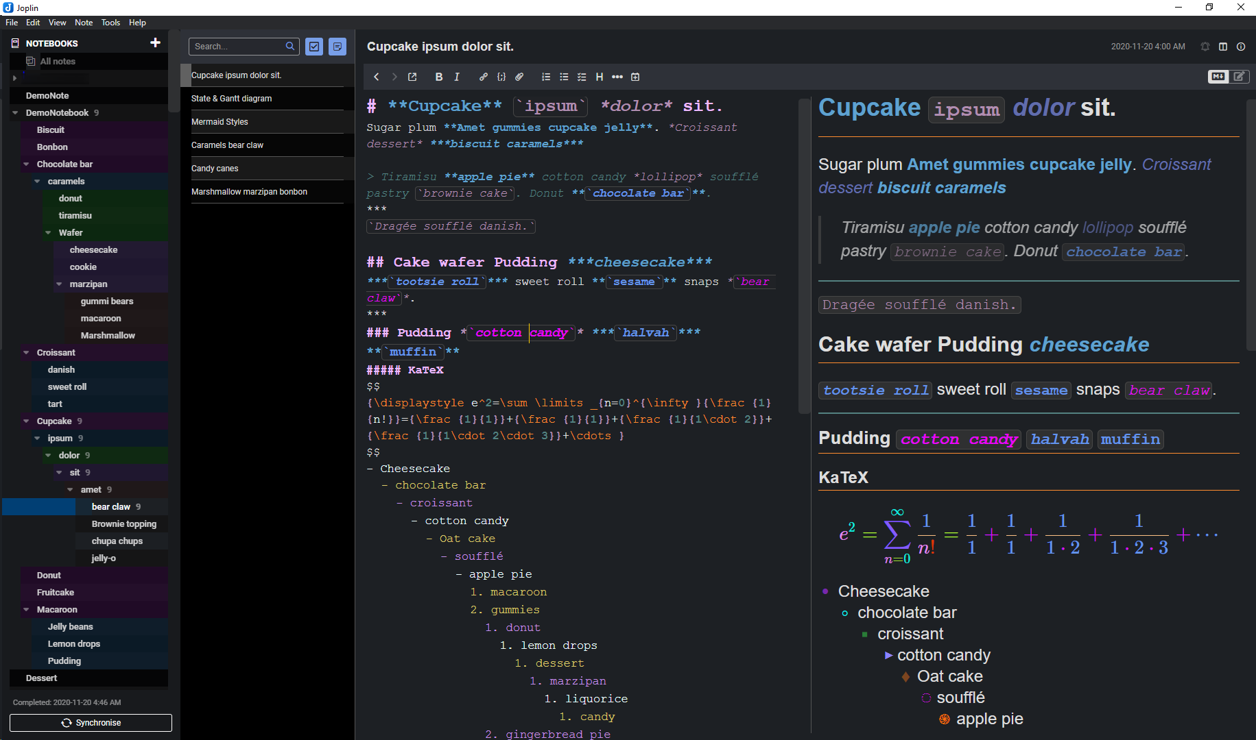
Have been refining the display for about a year, and recently took the time to dig around for some readability settings. After a recent update muted the alternating background on the notebook list, it seemed an opportune time to bring the wish list into fruition.
Mostly readability mods for higher resolution screens, intended for use with Dark mode.
It seems to help with taking notes and cuts down on cognitive friction while scanning/skimming through longer notes for details and broadstrokes, as well as adding some differentiating touches to make editing a little more intuitive.
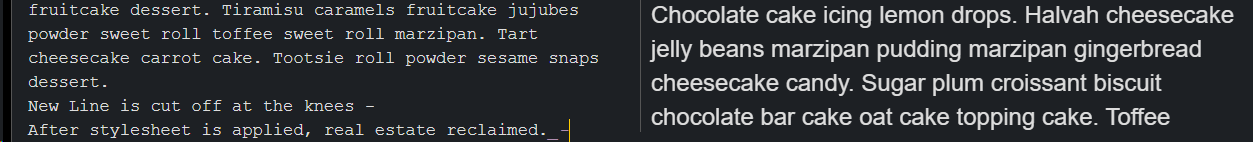
The add tags button can be optionally removed by uncommenting a couple of lines, left to remain so as to avoid making unexpected changes to the UI.
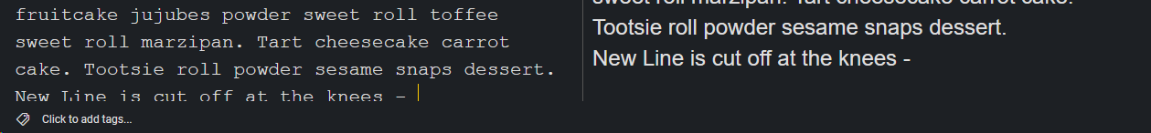
Regarding longer notes, on reaching the leading edge of the editor, the text has been cut off, requiring a mouse gesture to get the full line in view; a css fix bumps up the bottom to mitigate the same.
Since the styling for the active list item is dynamic, overriding it in it's entirety looks a little problematic. The closest approximation involved leaving the left margin untouched, which had a nested coloring effect on the list item anchors, while still allowing for the active row to achieve the 'highlighted' look, if only in the unmodified margin.
Before, with final line partially hidden during editing:
After, with Click to add tags... optionally removed:
The KaTeX edits are there as a boilerplate, as I saw a request for it from @EricB10. Next will probably be some work on the Mermaid display, thanks to @dpoulton for what looks to be a great starting point.
I also "played around" with the UI a bit. What I want to share with you now... maybe some of you will find something interesting for your own stylesheets.
I didn't really change anything about the colors themselves. Basically, I changed some UI elements (or tidied them up a bit...imho).
That means the UI should work with all built-in color themes.
Thanks, but what I wanted to do is change the background colour of tags from blue to green. Wth this I get a green rectangle to the side of each tag which still has a blue background. Perhaps I haven't placed your mod in the correct position?
I had misunderstood your intent; that snippet was meant for anotther stylesheet entirely, and is not at all what you were looking for.
It looks like you're looking to modify the style by @benji300 - in which case there are a couple of options, both in userchrome.css.
To change all elements made blue by this stylesheet, modify the --primary var at line 7:
  /* TWEAK: Adapt colors here (might not change colors everywhere) */
/*--primary: rgb(45, 107, 220);*/
  --primary: rgb(15, 105, 24);
To change only the background of the tags, modify the --tag-color var at line 30:
  /* TWEAK: Change the style of the tags */
/*--tag-color: var(--primary);*/
  --tag-color: #0F6918;
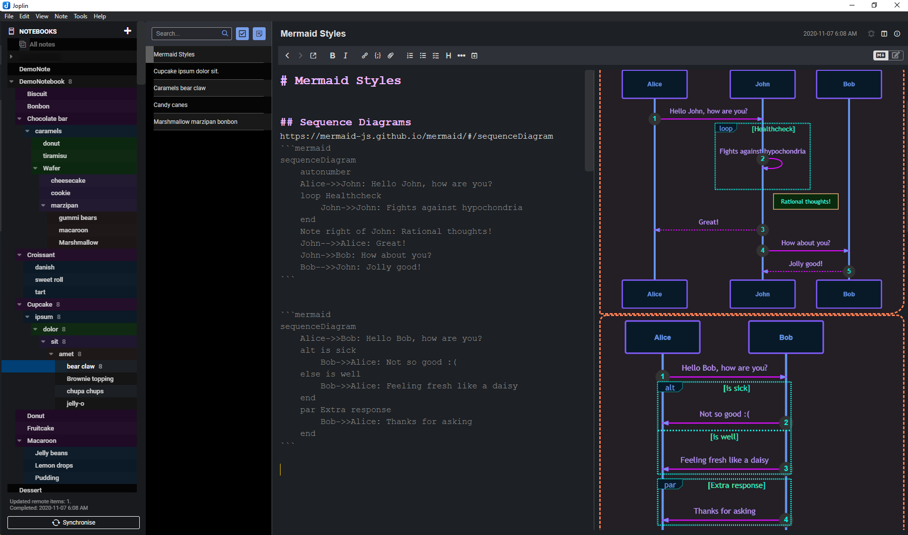
Started charting out a few processes, and ended up making a few Mermaid readability changes to this dark theme.
It could still benefit from a bit of finesse, but functionally addresses immediate usability concerns.
Addressed paths and weights; haven't yet gotten to Classes, but they are definitely on the horizon.
thanks for the starting point, it was quite helpful.
There are a few options that include the arrows on Flowcharts and Sequence diagrams.
Will likely circle back around and make a Bright theme counterpart for high contrast in sunlight, after addressing Class, State, and other diagram styles, as the need arises.
I've tried for a solid hour, but I can't figure out how to change the font family for code mirror WYSIWYG editor. I want to change the font to "IMWriterDuospace NF" and possibly adjust the size too. Can someone please help show how to do this?
 .
.