Back in May19 @bladewolf55 mentioned in a post the font Fira Code. This was recently highlighted by @bedwardly-down on GitHub who suggested I post this on the forum.
Basically using this font as your editor font, as well as in userstyle.css as a font for code blocks, adds quite a lot of interesting functionality to Joplin. I guess that this is because the editor and renderer Joplin uses is equipped to handle this type of font.
It enables you to use ligatures in your code. Rather than using <= or ~= the editor / font combo changes the text to the proper notation. Below is a graphic showing some “translations”.

You can use settings to apply it as your editor font by specifying “Fira Code” as your editor font after installing the it (available as either .ttf & .otf). It’s unlikely you will want it as your base / body font for rendered notes as it is monospace, but if you use inline code or code blocks, adding it to your userstyle.css means that your notes will use the ligatures as well.
code {
font-family: "Fira Code";
}
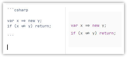
Below is a screenshot where I have NOT used the font as the editor font but applied it to my userstyle.css for the element code.

Here is where it has been applied to both the editor and the rendered pane.

Sure it is a bit specialised, but for some I am sure it would be very useful.
Finally, even if you do not use it for ligatures it is a very nice and readable editor font.