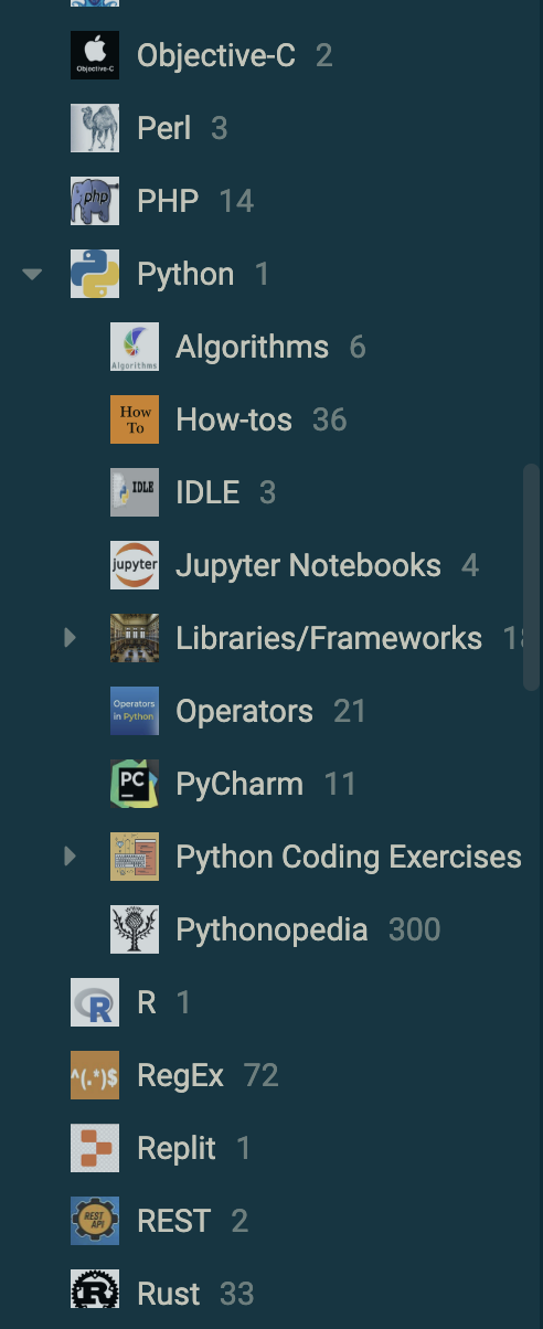
a notebook is showing as "empty" but it actually contains sub-notebooks with notes
Simplest fix: at least have notebooks showing they contain other notebooks (showing notebooks in the notes view is a bit weird but better than it is now)
Feature request: Joplin navigation should follow a conventional directory file view
I am writing to suggest a new navigation feature for the Joplin note-taking app. Currently, Joplin uses two panes, one for viewing notebooks and one for notes. I believe that this navigation system is ok but sometimes confusing, and that Joplin would be more user-friendly if it followed a conventional directory/file view instead. I'll often look for a sub-notebook in the current notes view and expect to see it there and get confused of what notebook I'm in.
In a conventional directory/file view, notebooks would be displayed as folders, and notes would be displayed as files within those folders. This would allow users to navigate through their notes in a more intuitive way, and it would make it easier to find and manage specific notes.
Here are some of the benefits of a conventional directory/file view:
More intuitive navigation: Users would be able to navigate through their notes in a way that is familiar to them, just like they navigate through files on their computer.
Just one pane for navigation instead of multiple
Conventional way of dragging & dropping notes between notebooks like you would with files and folders
I believe that a conventional directory/file view would be a significant improvement to the Joplin note-taking app. I urge you to consider implementing this feature in a future release.
If this was a replacement for the current view I would be very much against it. Imagine if I had a notebook with 500 notes, suddenly it becomes almost impossible to see my notebook structure. It also makes it harder to provide additional information for each note in the future which is a common request e.g. showing tags or thumbnails, dates etc.
You mean you can't deal with file manager apps such as File Explorer on windows and Finder on macOS because it's impossible to see your directory structure? There's pretty much a one-to-one relationship between notebooks/notes and directories/files. I would say the file manager paradigm is true and tried.
At the very least, I'd like to see subfolders on-top in the note list so I know there's something in the folder
Yes I completely agree. I am using Joplin now for 6 months and still this structure is so unintuitive, the last 5 months I was wondering what the problem is, until I made a side by side comparison with notion and understood what teh problem is. I completely agree with @joeschmoe that EVERY app I know uses the traditional structure. I will now tell you some things (as a new user) I encountered:
The feeling something is off - I suppose that is just because of other apps that ALL use this traditional structure. And I am not talking about notetsking apps in particular
VERY difficult to find a note when notebooks are similar. Now clear solution would be put more notes in a broader notebook. Right? Let's come to point 3
Not able to find a specific note. It seems like they are all thrown around that is it.
Even if you create a so called overview over the notebook or topic, it dissappears among the batch of new notes
@Daeraxa the problem you talked about a massive archive of notes in one notebook. Firstly that does not really affect many people in the notetsking community. Secondly that could be solved with a better hierarchy. Thirdly notebooks can be collapsed, so your point is already not valid. You don't have to scroll through them you just collapse and find other notebooks.
I have an even better suggestion:
The idea of notion and obsidian and other apps is that folders are also kind of files, in that regard that you can create an overview and link to other notes, or go to them through the sidebar. Trust me also that for users it would be also sl mich easier to change from these proprietary note taking apps to Joplin.
As a sidenote if you would create a poll with a random batch of people and ask them, what is more intuitive, what is more comfortable they would in a matter of seconds all answer the traditional way.
It is important to focus on note taking apps here I think as other apps using a tree layout often rely on the constant use of the tree slightly less, are dealing with a far less complex heirachy of folders, are dealing with fewer overall files or have methods of subdividing the tree via windows meaning you don't ever use the "root" tree.
Evernote (which Joplin was designed intentionally to look like): Notebook - Notes layout.
OneNote: Notebook - Section - Notes layout
Apple Notes: Notebook - Notes layout
Bear: Notebook (technically tags) - Notes layout
I do appreciate that some other very popular apps use a tree type layout (like Obsidian) but above we have 4 really large players in the note taking space that don't and I can only assume there is a very good reason for that paradigm.
Trust me also that for users it would be also sl mich easier to change from these proprietary note taking apps to Joplin.
And for the proprietary apps I mention above?
It is almost like it is a very personal subject and what is "good" is entirely subjective. I actually have a rather complex hierarchy but I also use tags quite extensively - especially on these larger notebooks which I otherwise do not want to have further divided. The fact is that in some cases where I do have lots of notes, the current layout is extremely efficient.
You don't have to scroll through them you just collapse and find other notebooks.
Which would add a whole bunch of clicks and scrolling that I don't currently have to contend with. I have an abundance of horizontal space on my monitor and far less vertical space so the current way of not having to keep expanding and collapsing notebooks serves me just fine as I can use my extra horizontal space more efficiently.
As a sidenote if you would create a poll with a random batch of people and ask them, what is more intuitive, what is more comfortable they would in a matter of seconds all answer the traditional way.
I'm not quite sure what gives you that confidence when a large number of note taking apps do not use a tree layout. Also traditional != better. We have different design paradigms for different apps for a reason as the use case is important.
Agree completely with this. I suppose I can see your side of this. So there are two different philosophies. That needs to be really thought through, because you definitely see the comfort of treeview for example in notion. But I can also see that people like you and i suppose laurent and many other users would not like the change
It's very easy to specify an emoji for any notebook or subnotebook, or to attach an image file, like a png or bmp, and these are very helpful in visual navigation through the Joplin tree.
Okay, I see what you mean. I don't usually have sub-notebooks containing notes without having any in the main notebook, which is probably why I never noticed that.
I don't always either, but it's a bit misleading when I expect there to be a tree of folders and I don't see it. I've found myself wondering several times what happened to a note only to see I hadn't navigated to the sub-notebook.
Example:
 travel
    ├── 2023
    │   ├── thailand - august visit
    │   └── vietnam - september
    └── generic note about getting a visa to vietnam
I will use the Goto Anything command shortcut to search for @travel because that's where I know I have the information about the current airbnb I'm staying in. I'll only see the generic note for getting a visa, but the other notes I'd have to search for @2023 which may have many matches, or find the travel notebook in the tree (and I have many notebooks and it doesn't auto-select the current one I'm in), and select the appropriate folder.
CC: @laurent
maybe you have a solution that would work for me here?
I would be interested in a feature like this if it was an option you could toggle easily (maybe in the UI, but a key combo would be fine as well), but for a slightly different reason: I like having joplin on my second monitor, which is vertical, and the current layout takes up a lot of horizontal space. Most of the time is spent writing or reading a single note in that case, so it would be fine if navigation is a little slower.
On a vertical screen, having notes and notebooks in a single pane is also less of a problem, as the sidebar is very tall.
Or I can tag the few notes I need to switch between if they're in different notebooks to make switching quicker.
Main Menu: View / Change application layout - you could move the Notebooks list above the notes list? (Can't remember what is default - I don't navigate much, I have my Notebooks at the bottom.)
I agree the notebook and notes navigation wasn't intuitive at first, but I got used to it. I agree with not quite wanting the notes themselves to show up in the tree if that were the only option. File Explorer does not do that - they appear on the details side and the tree (if any, e.g. when using Libraries) is on the left.
It could be a quick improvement if in the notes list, it displayed (optionally) the name of the notebook at the top.
Why not in this way? This works great. The first image is a screenshot of the Windows 11 file manager, and the second image is an open-source note-taking software.-Siyuan
yeah, my problem is still viewing a notebook and seeing it empty, when it does have something in it even if it's not notes. I get just as shocked every time thinking my notes are lost. Goldfish.
Summary: A notebook could easily show itself containing other notebooks
@laurent iirc one of the upcoming features is the ability for plugins to interact with the note list, does this include the notebook list to? And if not would you consider adding that as well?
My thought process is that if a plugin could interact with the notebook list, out would then be possible to simulate the combined "file explorer" style view discussed in the thread. Then someone could make a plugin and the user would just hide the redundant notes panel (with the "hide notebooks and notes" plugin).
Then, if a user wants a combined view, they can just install a couple of plugins, but the rest of the users who enjoy the separation aren't forced into a different system.
This is one of the reason why I still need to use Trilium for my project works. Because Joplin way of folder structure is impossible to maintain orderly project structures.
In fact, I don't understand why the tree layout is intuitive, but the note layout is not. The note layout is also straightforward and easy to understand.
When I was looking for an Evernote alternative and tried Obsidian, I disliked the tree layout. Switching folders by a mouse click is challenging when you have a lot of notes inside a single folder.
Switching folders in the note layout is easy, regardless of the number of notes inside the folder. It is also easy to drag a note to another folder since the folder structure and notes list are in different columns.
I manage the folder structure using the PARA approach, which keeps the tree simple but results in having a lot of notes inside a folder. I frequently change the note folder depending on the current state, such as moving finished projects and yesterday's notes to the "Resource" or "Archive." The note layout is more effective for this purpose.
In Mac's Finder (the default file browser), the "column mode" is probably the best way to browse files for most users. It don't have any thing like the tree layout component in Obsidian / Notion.
If that is an option to switch between the tree layout and note layout, I wouldn't be against it.
I must really have explained it poorly. The unintuitive part is when I search for a folder and select it using "Goto Anything" with @foldername, I jump to it, so I don't see where I am in the tree. The folder shows up empty, in the notes panel, however, it's not empty, it contains sub-folders with lots of notes.
In order to find the sub-folders and those notes, I still have to go back to the notebook list and manually find the notebook.
The other way this could be solved I suppose, is that when I search and select the notebook, the notebook tree jumps to the location. Now that I think about it, this may be the best way to fix this and I'll make a separate thread about this