Just another little enhancement: preferences on a mac appears in the menu bar on App>Preferences; thought Joplin uses the good keystroke to bring preferences on the front, is it possible to put them in the right menu and with their right name (preferences better than general options)? Not an urgent features, but it tooks me an hour to find them…
The reason for that most likely was that there are different options: Web Clipper, Encryption and General.
So you would just move the General Options to App -> Preferences…?
That’s an easy task and if @laurent gives his ok, I can do this fairly quickly.
Yes moving the General options there and renaming them Preferences on macOs would be good and more standard. How about other options like clipper and encryption, should they be moved under that main menu too?
I'm not sure. I liked the fact that they were separated. However, since the options are now in their own sections, it would be possible. It's a matter of opinion. I like them to be separated, others might want to have all info in one place. I'm just afraid that when combining all 3, the option window will be too overwhelming.
With you on this one. I'd always liked I could jump to the relevant bit right from the menu. (And the logical separation is pretty clear there, so it's not like someone might get confused and look for the text size setting in the wrong menu, or something.)
One more thing, Check for Updates... is also in the app menu on a Mac.
We should move that too.
While we’re at it… The About Joplin menu item should be moved as well on a mac.
The first menu on a Mac usually looks like this:
  About Appname
------------------------
  Preferences...
  Check for Updates...
------------------------
  Main Menu Items here
  ...
  ...
  ...
------------------------
  Services
------------------------
  Hide Appname
  Hide Others
  Show All
------------------------
  Quit Appname
To make the app more like a macOS app, we should not only move the General Options menu item, but also About Joplin and Check for Updates...
Please let me know what you think.
Ah, I think I misunderstood your question. Nope, I think they should stay in Tools.
Sorry, I have posted too many replies. This was not on purpose, it's just that as soon as I hit reply, something else came to mind....
You kmow what, I'll create a menu that looks like a mac menu (only for macOS) and you can decide, if you want to go with it or not. Not sure how much time I have tomorrow, but I'll create a PR within the next 2 days. I'll add screenshots of the changed menus.
My concern is that the options will then be split between the “Tools” menu and the main menu, so I’m wondering if we can simply move everything to the main menu on macOS:
  About Appname
------------------------
  Preferences...
  Encryption options...
  Web Clipper options...
  Synchronisation status
  Check for Updates...
------------------------
  Main Menu Items here
  ...
  ...
  ...
------------------------
  Services
------------------------
  Hide Appname
  Hide Others
  Show All
------------------------
  Quit Appname
Or maybe using a sub-menu like on Sublime Text?
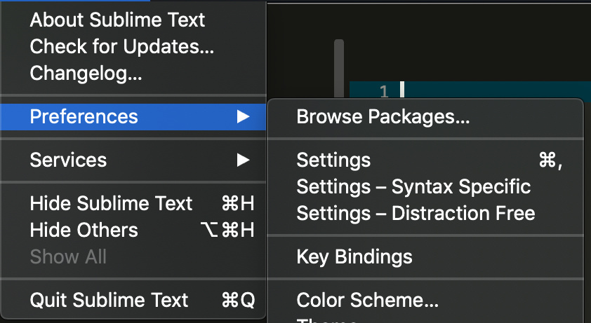
The first solution sounds good to me; the sublimetext submenu solution is not so simple and useful. As there are not so many item, it seems better to me to not add a submenu.
Well, Encryption and Web Clipper are tools that are not part of the main configuration. If you move these 2 to the main menu as well, the main menu will be less well-arranged and the Tools menu will only have Synchronisation status as a menu item.
If you move everything to the main menu, it looks horrible. I think moving all menu items from the Tools menu to the main menu is a mistake, unless....
...if you really wanted to move everything from the Tools menu to the main menu, I'd opt for a Preferences sub menu. The general options screen is reachable via a shortcut anyway and it leaves room for additional menu items: e.g. a plugins menu item and screen for future plugins maybe (check out Caleb's PR)...
It also makes the menu a lot cleaner.
I'll try using a sub menu this afternoon (EST) and you can have a look how you like it.
Actually the result doesn’t look too bad. Threfore we can lose the Tools menu on macOS.
Thanks for creating a macOS-like menu structure.
I would suggest to also introduce a "File" main menu. In most mac applications, you will find a structure like this:
Joplin File Edit View Tools Help
About, Preferences etc. under "Joplin" as you suggested.
I would move these items to the "File" menu:
New note
New to do
New notebook (add a keyboard shortcut)
Import
Export
I really miss the File menu which is present in all other apps on macOS 
This depends on @laurent. I don’t mind either way. Although not all macOS apps use a File menu. iTerm2 uses a Shell menu instead.
Thus a Note menu could be more appropriate…
Correct, some apps use other words.
Apple also has some recommendations:
https://developer.apple.com/design/human-interface-guidelines/macos/menus/menu-bar-menus/