I think the difference between "Donate" and "Sponsor" is that donations are tax-exempt. From my understanding Joplin is not using Open Collective or something similar, so its not tax-exempt. Therefore I would go with "Sponsor". (The tax-exemption part also depends on the country, so its not a definitive answer)
For me it looks blurry on a 25" 1440p screen. But thats only in Firefox 89, in MS Edge (Chromium) it looks much sharper. I took a screenshot, where you can see the difference. The writing in the top screenshot is not as sharp. On the screenshot the difference it not as clear as it on the screen. Seems to be some rendering issue in Firefox so I am not sure how much you can do about it.
@Yann1ck, I've turned the top image into a responsive one now, so it should display a higher resolution on larger screens. Any chance you could check again to see if it's any better?
Its a little better but still not 100 sharp and it takes really long to load. I am not sure what the problem is. Perhaps the its a issue with Firefox rendering or related to Windows display scaling or whatever else. Or its just my eyes.
Thanks for checking. I'm going to remove the very hd image then if it doesn't make much of a difference. The main problem is that I have to use a png, because of the transparency, so it's huge. A jpg would be much smaller but of course it doesn't support transparency.
Ok another attempt - now I've added a picture tag that selects either a webp image (much smaller size, and still with transparency) or png (a lot bigger) depending on the browser and resolution.
I looked at it again and the problem is caused by the image-rendering: -moz-crisp-edges and image-rendering: -crisp-edges properties.
For me the picture looks better in Firefox, without crisp-edges rendering. In MS Edge and Chrome it looks better with crisp edges. You can easily spot the difference, if you activate/deactivate the property in the inspector. I think the browsers use a different algorithm. Perhaps Firefox is overshooting which negatively impacts image quality. Other explanation: its just my visual perception. So the best would be if you just check for yourself @laurent and see if you can spot the difference.
I'll take the chance to be even more nitpicky (is that a word?) than Sophia some posts above.
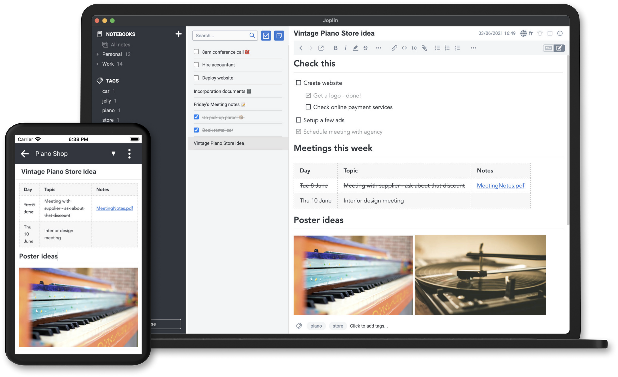
In the screenshot on the homepage (linked in the post I'm answering too), there's the open points about "online payment services" and "set up ads". This being an open source project and all, I'd rather not mention these words on the homepage at all, not even on a small screenshot.
I know that this is an example note that has absolute nothing to do with Joplins direction, but better safe than sorry. Anyway, that's my two cents for this evening
I don't know about the general plans for the homepage navigation (the non-frontpage sites), but to me the current ordering does not yet feel optimal
In general, I'd make the headings (currently: Applications, Support, ...) clickable. Clicking on "Applications" would then give a short overview page that gives a 3 line blurb about Joplin, lists the various applications with links to the sub-pages and the fact that all of them sync to each other (!).
Further, I suggest to do some renaming / reordering:
Applications
Desktop application
Mobile application
Terminal application
Web Clipper
-->
Get Joplin
Joplin for Desktop
Joplin for Mobile
Joplin in Terminal
Browser companion (Web Clipper)
Joplin Cloud (explain what it is and why it is great!)
Split Support in two parts. One with the explanations, aimed at onboarding new users; one with actual support resources.
How to...
use Markdown (Markdown Guide)
resolve conflicts (What is a conflict)
enable end-to-end encryption
use the Rich Text editor (About the Rich Text editor limitations)
potentially: additional future tips and tricks, e.g. "how to organize your notes" explaining about tags and nested notebooks; "how to find notes" explaining the global goto, ...; "how to extend Joplin" explaining the plugin system for the end user
Support
Troubleshooting (FAQ) (many entries in the FAQ seem to be targeting problems, not day-to-day usage)
Joplin Forum (make it open in a new window? or add some icon that signals "this leads to a new page"?)
Enable Debug Mode
Then imho move everything below to a separate page "Resources for developers" or similar, as non-programmer will understand none of it anyway (but might get confused).
The only thing I'd keep (and where a more prominent place would be nice) is the "About" section, maybe renamed to "What's new?".
Quick addendum, but didn't want to make the previous post too long.
I'd vote for a page "The team" somewhere that gives a (short or long) insight on who develops Joplin and for what reason. Both to give an idea about who is behind it (single person? team? company?) and to motivate that it is volunteer work and people should donate
Quick rough proposal:
Joplin is developed by a team of volunteers. ### people have already contributed code to Joplin! If you want to support Joplin, please see the support us-page.
Main developer
Laurent Cozic, born blabla, living in blublub, founded Jolin 1997 for reason A, B and C. He currently dedicates x days per week to the development of Joplin and also provides the Joplin Cloud service since 2021.
Joplin core team
Working with Laurent, there's a team of x people who regularly contribute to the Joplin development.
Person A (country), profession
Person B (country), profession
...
Google Summer of Code students
In 2020 and 2021, selected students from around the world extended Joplin with additional functionality.
Student A (country), GSoC topic (2020)
Student B (country), GSoC topic (2020)
...
You?
If you want to contribute to Joplin development, head over to the developer resources | the forum | the github repository.
I suppose this isn't really related to the website but the webserver/provider, but I think it would be nice if you could force connections to upgrade from HTTP to HTTPS on the site since it isn't being done presently
Hmm, yes the idea is to tell a story with this screenshot, and I thought some plans of someone setting up a new business could make a good topic. And of course if you create a new business you need to advertise it. But I see your point that "ads" has the slightly negative connotation, especially for people who are into open source.
For what it's worth, after 5 days of A/B testing, "Donate" is a bit ahead of "Support us" (56% vs 44%). I'll post the full result when the experiment has completed.
Will we be able to eventually translate the new website? It looks really great!
Additionally, I'm experiencing the same issue as Yann1ck, most large images look really blurry to me, also using Firefox. Definitely looks better on a Chromium browser.
Have you checked if removing the „image-rendering“ CSS styles fixes it for you? You can try in the developer console. That worked for me. Than perhaps @laurent could fix it.
Thanks for checking, that looks better now. I was probably using the image-rendering tag incorrectly and it's better to let browsers do their default behaviour.
Nitpickin' time! I noticed the new blurb that invites people to try Joplin Cloud. Again, I would underline a word there for the sake of consistency, in this case, probably "together".
Also, when you go to the cloud plans link, at the bottom it mentions the discounts and if you qualify, to "contact us". It would be friendlier if you made that into a link - even if it only points to the forum - so that people can actually contact you
Oh and the description of why people would want this is very geekish. I don't find this paragraph at all enticing:
Joplin supports various ways to synchronise data with cloud file hosting services. It does that in a generic way, which allows it to support many providers. However there are limits to what can be done in such a generic way - for example, certain performance optimisations are not possible, and more advanced features such as the ability to publish notes or share notebooks cannot be implemented.
I started yawning at the second sentence... I'm not a good writer so I can't really suggest improvements, but I think the whole "generic way" thing could definitely use some editing... with a focus on why Joplin Cloud is much more convenient. More along the lines of "we do the technical stuff so you won't have to" type of reasoning. As I said I'm not very good with words, so I hope that didn't come across as overly critical