@giteshsharma Great job man! Designs look super classic
I agree, excellent look, the colour is perfect, would also love to see this implemented 
Very nice. I would like to see this implemented in the future as well.
I love the look and feel! Well done!
However, I generally use the markdown+preview side-by-side layout in Joplin and these concepts don’t seem to take that mode into account yet.
It seems like having the formatting buttons on the right side would conflict with a layout that had editing in the left pane and preview in the right pane, as the buttons would be attached to the uneditable preview rather than the editor. Maybe flipping the editor and preview would be palatable?
I don’t think the bottom or top button layouts would conflict with the side-by-side, but I recommend reviewing how the side-by-side layout would look with these proposals while they’re in concept stage
Beautiful designs and simplicity, but I had same thoughts as @themightychris that markdown and preview screens are not reflected here.
What I would like to see is a UI where the markdown is displayed for the paragraph where cursor is located and the balance of the document is in preview mode. That would let users see if my markdown is working and edit it in the same screen. I don’t know if that is possible, I’m not a programmer, but this would eliminate the dual window and toolbar relationship problems mentioned by @themightychris and it would totally improve my user experience over having dual windows.
I would also love to see a search field in the toolbar that allowed users to search for markdown examples (tool functions) and insert a snippet of example markdown. There are just too many markdown options to have in toolbars but it takes a long time and repeated use to remember markdown for all the table, math, defined lists, etc. Ideally, there would be a filter icon next to the search that allowed selection of the enabled markdown plugins.
Right now I use notes with markdown examples but they are clunky. Still, maybe notes tagged as markdown examples could be used as libraries to store the menu items and make them readily customized by users. Then the filters would search the tagged notes and users could create favorites and share them. If icons were associated with the example snippets custom toolbars could be made accessible to end users.
Nice proposal.
A few questions to make sure you consider all the details:
I’m not sure I would want to have the new note, todo, notebook actions always visible and taking up so much space in my note list. I would prefer to see two more notes listed than have these options there.
The search bar also shows the number of results, are you proposing to show it in the search bar itself? It isn’t shown.
Tags is all the way at the bottom of the sidebar. If we get a ‘trash’, where would it go?
The editor pane is nice and clean, but how does it look with the markdown panel? Where does the formatting toolbar go in that case?
Where will the backward/forward note navigation buttons go?
Last, but definitely not least, where are the note tags displayed?
Edit: Also don’t forget about the “search in note” feature. In your design, it looks like it will get confused with the global search function.
An impressive list of objections, but unfortunately it lacks a breakdown-list of feasable options according to the many app-screen-resolutions. (As he remarked on his 4K 1980 screen.)
No, just kidding.
I am not quite quite in line with DShirk.
With Joplin we have a very capable (up to minii-problem-sized) note-taking tool. It is then up to us (users) to find those feasable .css-solutions to those bugging milli-micro-nano-problems. And, are they that bugging ?
Without studying these in too much detail (quick first impression, that is), they look and feel very good to me. It definitely feels more polished and modern. I do notice one inconsistency. You have established a pattern with + New Notebook at the bottom under a horizontal rule and + New Note and + To Do at the bottom of Meetings under a horizontal rule. When you get to tags, however, you seem to switch the pattern and still have the big add button (plus sign) by the header, “Tags”. I’m just thinking of the classic usability law: “things the behave the same should look the same.”
Nice job for starters! Again, this is just a quick first-impression opinion. Mostly pertaining to “feel”. I did not study it and think hard.
They look absolutely awesome! Make sure to provide a dark mode too though. Separate solarized light and dark modes would be highly desirable too.
The new Aritim Dark theme with this would look gorgeous. If you need any help implementing this, do let me know. I’m always happy to help!
Was my thoughts directly as well. Already started to draw how I could get the theme to work if this design is implemented.
First of all thanks everyone for appreciation and praising
I tried to include all the things that I previously missed and thanks everyone again for pointing out these things.
UPDATE 1
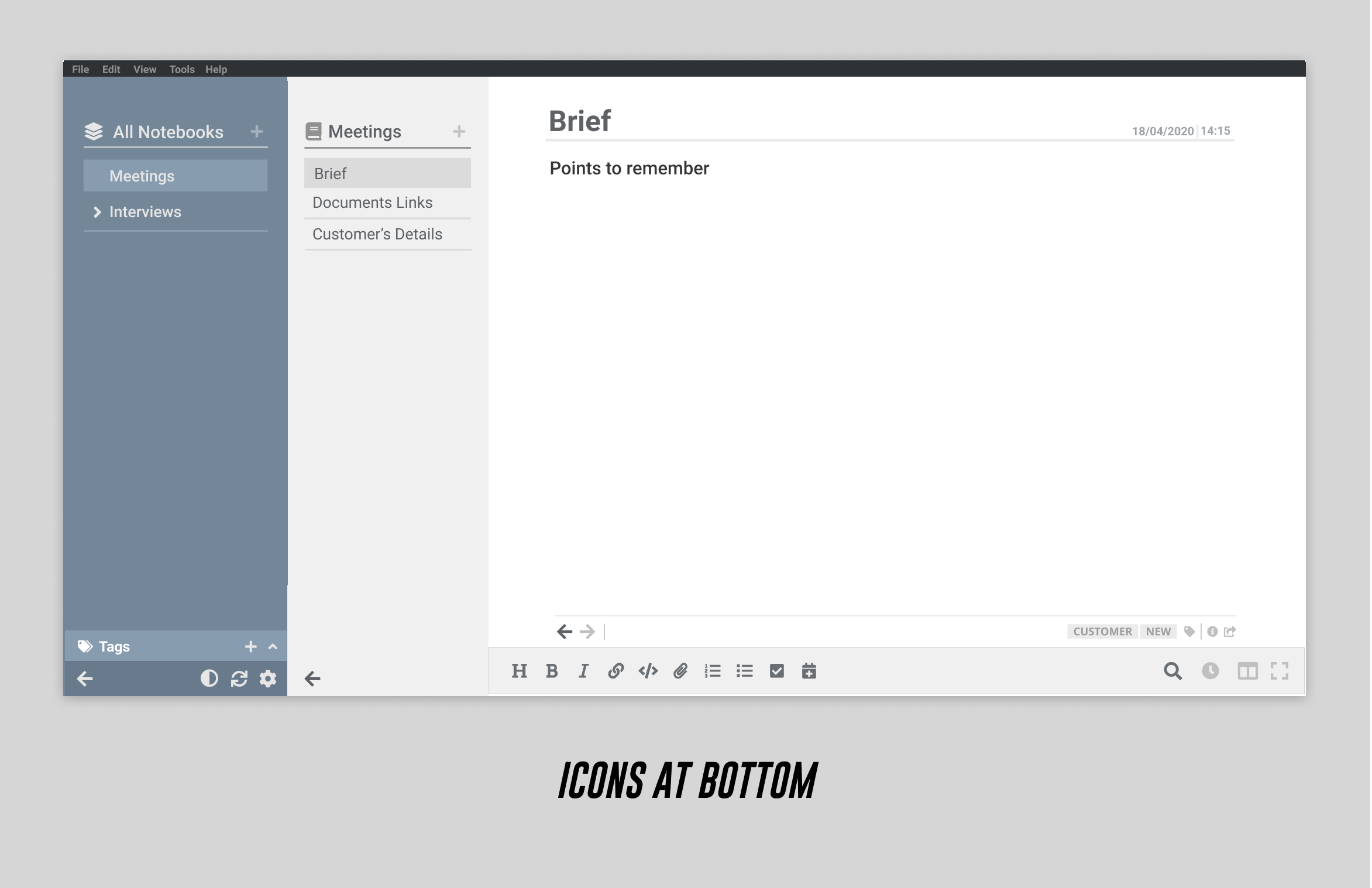
Few Small Features Ideas and Updates


Hide Sidebars
This feature will perfectly work as sidebars are hidden but icon bars have less opacity,
whenever user move cursor on the right side of the screen icons will be more visible.

Properties
Instead of using two different button, we can show properties by single button


Search
@bedwardly-down I tried to improve the search bar and searching, I think you were suggesting the same thing, Isn't it?
I tried to improve this in new mockup, check them out


Updates for previous layouts
- Adding back/forward button
- Adding Tags
3. Managed Icons
Damn correct, I think these new layout will solve this problem and I also added classic Joplin design in mockup.
I had the same thoughts and tried both things (lines and different bg), but finally moves some buttons at bottom as you can see in the layouts and horizontal lines for buttons which have same functionalities.
Although I tried lots of other things and put them in google drive and you can view them by visiting the link at bottom of this post. And If you have other suggestions then please add as your suggestions are good
Brief is title and it will stay top of the screen
4. Plus sign in header to add new notebook/ new notes
Done


Classic Joplin Layout


I tried few more changes in classic joplin layout


Different Layout
I create another layout but does goes forward with it, what are your thoughts about this one.
In this layout I put tags below title.
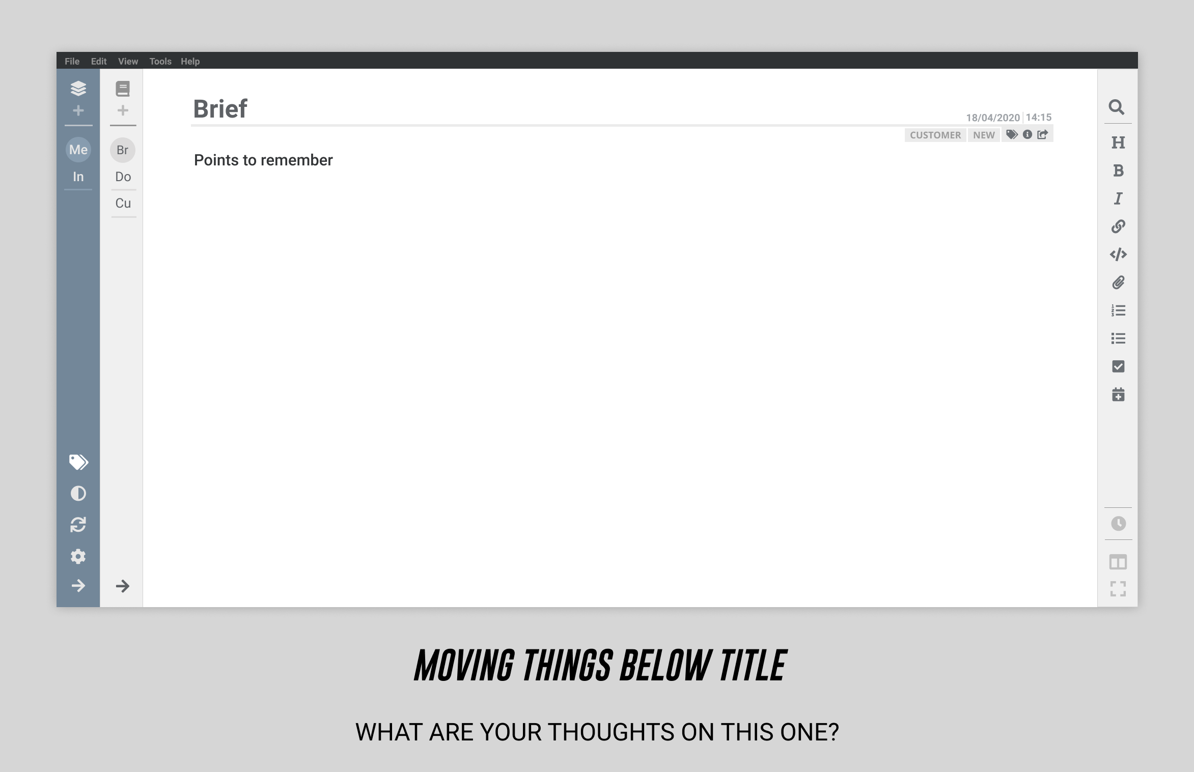
EDITOR+VIEWER
I think markdowns are not that great in this mockup and will them for sure


Other Layouts
I tried lots of other things in icon-bar like diff bg color, border etc and these things are not included in this post. I choose the best one for the post but still If you can check them out and give feedback it will be really helpful. I uploaded them on google drive
Link
TODO Feature
This feature is not included right now in the above layouts because we wants global todo list and local todo list both. And I am note sure how to implement this.
I am thinking of creating a todo box in notes-list just like I created for tags in notebooks-list. And dividing global and local todos there
If you have any Idea please share.
Yeah It will be great if we add such an option for user
You are right, we will add an option to switch editor/viewer's position to left and right and this will solve this problem.
Sure I will, Thanks bro ![]()
Great new mockups. The only thing I do not like is that visited notes are shown differently in the list than unvisited notes. When is this reset? After every restart? As soon as you have created a note is it visited. This makes no sense to me.
There should be no distinction - or at least an option to turn this off. This would be a very annoying feature.
Visited notes in notes-list of search results are of diff color, so people can track which tabs they have checked and which are left.
And I think everytime they restart the app it will restart. Or we can restart it everytime user search something new
Ah, ok. This makes more sense. Only a difference (visited/unvisited) for the search result list. It still would have to be defined when that is reset.
What do you think of scrapping the toolbar and just make it inline, like show the toolbar on selecting text, similar to the one in medium

The disadvantage of this kind of toolbar is that you need to select text to use it. While for Markdown, you might want to press a button even with nothing selected to get the format syntax, like in Discourse. For new user who don't know the Markdown syntax it's also a good way to learn.

To be honest, it’s not needed. We don’t have to repeat any functionality. Users have a habit of using Joplin with a toolbar and just adding too much in context menu is not a great UX. You can see that in some great and stable note taking apps like Bear, Notes(Mac), etc. Keeping the idea of functionality simple and usable is more of a focus here.