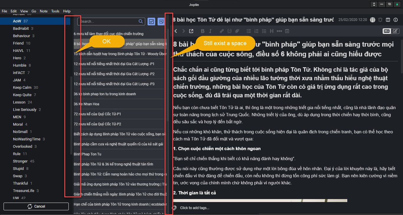
Hello,
As title, pls see details as attached picture below:
After do this, Joplin UI will be Cleaner as below:

Pls check and make change for better Joplin
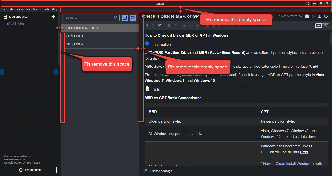
Hello,
As title, pls see details as attached picture below:
After do this, Joplin UI will be Cleaner as below:
Pls check and make change for better Joplin
Hi @F5LV
Joplin supports customizing the application with CSS. You can create the correct file by going to Tools -> Options -> Appearance -> Advanced and clicking on Edit under "Customize stylesheet for Joplin-wide app styles"

Add the following css
* {
	padding: 0px !important;
}
It will remove almost the padding that you have highlighted.
Hi@CalebJohn
- {
padding: 0px !important;
}
opx
This will make wrong to Notebooks folder hierarchy
i already tried with:
-2px ; -1px ; 1px ; 2px
but cannot solve the problem,
You can test it yourself
Well that's, like, your opinion ![]() I think it looks a bit too squeezed like this, and also you cannot remove the top space without removing the whole menu.
I think it looks a bit too squeezed like this, and also you cannot remove the top space without removing the whole menu.
Custom CSS is most like the way to go here. You can use the development tools to see exactly what elements need to be flattened.
You can use the below
.list-item-container > div, .list-item-container > a, .rli-editor > div > div > div > div + div {
	padding: 0px !important;
}
Hi CalebJohn
Hi laurent
Pls add option: Hide the Menu and Show it (a Shortcut key: ex: ALT )
This topic was automatically closed 60 days after the last reply. New replies are no longer allowed.