The latest version of Joplin sets a maximum width for the note content in order to improve readability.
You can disable this by going into Configuration > Appearance and set the width to "0".
The latest version of Joplin sets a maximum width for the note content in order to improve readability.
You can disable this by going into Configuration > Appearance and set the width to "0".
Thanks for putting this here.
I had edited my userchrome.css to manually set a width and was wondering why it had changed even though the changelog (joplinapps [dot] org [slash] changelog) didn't say anything about editor changes.
After digging through the Github commit log, I found several changes to the markdown editor style and CodeMirror interface.
This makes me wonder, is there a place where a more detailed changelog is available? Or is the Github commit log the only alternative? And if it's the latter, is there a reason against putting more details in the changelog?
I think it could be effective for avoiding some redundant forum posts / Github issues.
Looks like it just hasn't been updated yet for v2.3.5. You can see the changelog here.
It seems the website is often slightly out of date in regards to updates.
I discovered this feature on Linux when I updated to the 2.3.5. I checked my Windows 10 machine that was at 2.3.3 and it was fine but updating to 2.3.5 introduced the gap. I used Tools->Options-Appearance and set Editor maximum width to 0 (default was 600). All works fine now on Windows 10 and Linux with Joplin 2.5.3, Thanks for the tip,
I came exactly for this! Thank you.
Before, I did this with custom CSS; I think we talked about this in the custom CSS thread like 20 years ago. It's great, thanks!
i didn't see that in Mac Mojave under Preferences>Appearance, but kurtis's ref to "Editor max. width" gave me a clue to start from…
@lwb52, you're quite right; @laurent ought to change the OP in this thread to add the instructions for Mac users (Preferences > Appearance instead of Configuration > Appearance) and that the box is labelled Editor maximum width.
Let me add my voice to those who experienced confusion with the 'sudden' margin increase and the need to override it with the user stylesheet. Wouldn't it make sense to keep the default at 0, while allowing Editor maximum width to be set to 600? Better still: on a new installation, it could default to 600; on an existing installation, let it remain at 0.
I'm always keen to stick to one of the golden rules of UX/UI, the Principle of Least Surprise.
with the 'sudden' margin increase and the need to override it with the user stylesheet.
Just to be clear, you don't need to change your user stylesheet to fix this - changing the settings should be enough.
The term Configuration > Subconfig is used in the entire documentation. Why, you might ask.
Because on Linux/Windows the configuration/settings/preferences are under Tools > Options and on macOS Joplin > Preferences...
Thank you for this as well as explaining the rational behind it. After reading the article I'll give it a go and leave the default. Didn't like it at first but it after giving it a shot it really does seem more much more readable, less cluttered and easier to look at which is actually quite nice 
That was a poor choice.
Unfortunately, ‘least surprise’ collides with any improvement, if taken too far. 
I think it looks better now, in my existing installation. I’m sure I would have missed the announcement that there was now a new option.
I like the idea of the margin, particularly because when toggling rich text and side by side layout the text does not change dramatically, so it is faster to find things and to keep working.
However, may I suggest an improvement? The text seems a bit to be floating around, so may not be so easy to work with indentations of different levels. So maybe lines or a different color on the left and right sides should help with this.
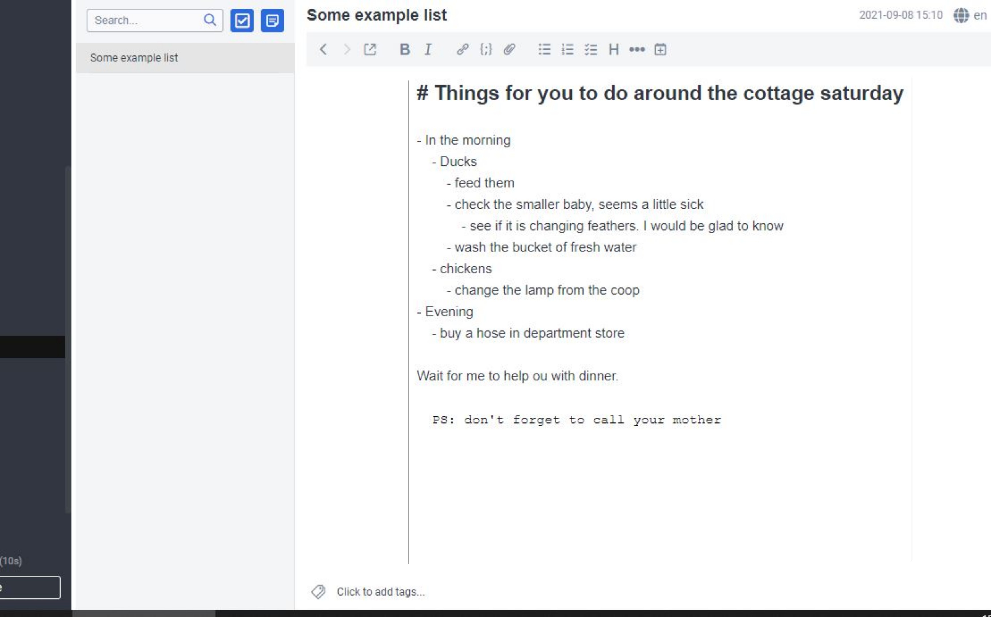
I made some fictional example:
Personally, I think that it would be useful to have an additional setting that would define whether the text block should be centred (as it is now), or aligned to the left (while keeping the defined width).
Right now, it is all or nothing, and in my personal opinion, the centred text block looks off, especially when considering that fact that both the title and the editor buttons are still left-aligned.
I like it, and it improves readability. I am curious if it is possible to define elements to belong to the margin, like Tufte style for LaTeX?
This would be nice, specially if I could put the the auto numbering from katex in the margin. Otherwise, equations sometimes are bellow the equation number and this depends on the screen size.