Hi Folks -
I’m fairly new to Joplin, and loving it. In particular, that appearance of notes can be changed with (a) style buttons; (b) markdown; © html; (d) css stylesheets; and (e) combinations of these. Also, importantly for me, syncing between laptop and phone just worked straight out of the box (I came over from spending hours over several days in the past trying to get Tomboy/Tomdroid to two-way sync successfully, and eventually giving up).
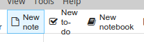
Anyway, loving control over the appearance of notes, but the above image shows a quirk in the appearance of the GUI on laptop: when the horizontal size of the app is reduced (which it normally is for me because I use it for lists), and because “New to-do” is treated as three very short words, it immediately gets spread over three lines and they don’t quite fit. It’s a small niggle I know, and visual rather than functional - but is it also an easy one, like changing something to a hard hyphen or removing the hyphen altogether?
Many thanks in anticipation.
Hmm, yes I guess the text should simply not be wrapped at all. Any change you could create an issue for this on GitHub to track it?
Thank you Laurent. I wouldn’t suggest removing wrapping altogether. Not only does it work perfectly well for one or two words, but like wrapping generally, it adds functionality. Specifically, it allows more of the items on the toolbar to be visible on a narrow window. If I were a regular user of the searchbox in a narrow window, I would curse someone whose concern about “New to-do” over three lines lost me that functionality.It’s literally because three words is too many for the height of the bar, and not otherwise.
Interestingly, date-and-time wraps perfectly on the bar below, so presumably a date with a slash and a time with a colon get treated as a single word, and it’s only hyphens that show this anomaly.
It occurred to me an alternative approach is to allow icons without labels, like in the styling bar - after all, the labels are only needed until people learn what the icons represent.
I had a look at github as you suggest. I found the issue tracker okay. “Commits”, “pulls”, “branches” etc are outside my comfort zone, but I could try to follow the instructions to post an issue; though thought I would await a response to this before framing the issue.
if you did not open an issue yet, we can do it for you and link the current post to the issue
issue opened