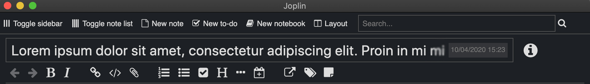
However, it doesn’t look good from the UI point of view. I had an idea to move the date/time into the Note Info dialog along with other information regarding the note. The end product would look something like this.
I saw in Bear app, they’ve also used just the i button to show all the info but Joplin shows date just at the right-side of the title bar and that’s a great feature which we should not ommit and as i see we want to shift the i button to the right side of Title box, what we can do is put the the date inside the right corner of title box and whenever the user :hover or :focus on the titlebox the date-time will disappear and will be visible again if focus is removed from the titlebox.
Some options which i’ll like are :
@rabeehrz, I honestly agree with that. That’s part of why I thought the icon should be on the left side. The date time part would look terrible with the icon next to it, but I didn’t take into account that that info could just be moved into the input box. Although, to be fair, moving it directly into the Note Properties might be the better option. The hidden view looks better to me.
Yep. The hidden view looked better to me too. But Tessus has some concerns. I’m working on making the UI better. I think the best option would be to move it under the date and time, like Tessus suggested.
What about moving the date into the toolbar area? I personally like having it visible because I use it to double check that something has synced properly from other devices, although I wouldn’t mind if it was hidden / only visible in the “i” at smaller widths.
But I also believe that just moving the info buton to the right of the toolbar is enough:
In fact there are 2 issues here. A few people complained that the toolbar also contains items that have nothing to do with editing, although I don’t understand that complaint, since all of these icons are located on the right. So they are already properly grouped.
So theoretically we could move all those icons next to the border, in which case the info toolbar button (the most-right one) would not be as prominent.
I believe moving the info button is more than enough.
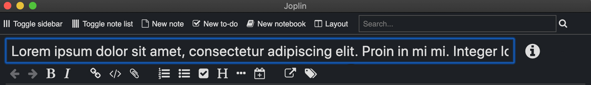
Ohh, actually what i meant was that if the current focus of the app is on title bar which means user wants to see the whole title or change the title, the date & time will disappear for the time being the focus is on title bar. But as soon as the focus changes to any other component (i.e. note-body, toolbar, notes list, sidebar, etc.), the date & time will appear again in the title bar. That’s what i was trying to say and frankly getting the focus values from title bar wouldn’t be soo hard and this style will be quite minimalistic as in case of future, joplin adds quite some tools in toolbar.
Another issue is that we now have two editors, so it would be best if the editor toolbar could contain only the editing actions, and another toolbar or button I’m not sure, would contain the note-level actions. That way the note-level actions can be shared between the two editors.
Best is to look at what other apps are doing as it’s not unique to Joplin. I’ve checked Evernote and Bear so far but will check others.
Other apps don’t have 2 editors - at least not in the sense as Joplin does. 2 toolbars won’t look very good, unless they are in one line.
If you split the toolbar into 2 because of their functions you would actually have to create 4 toolbars:
back / forward buttons (history)
search result button that shows the notebook for a note
markdown buttons
note actions
Right now we still have the problem that the <--> buttons are not always the left most buttons (do a global search). I think fixing that would be more important than the visibility issue (split toolbar) one.
<- -> [spacer] [In: xxx] [spacer] B I [spacer] other editing icons [spacer][spacer][spacer] note icons
other editing icons
note icons
edit in external editor
tags
content properties
flexible spacer
note properties (this icon at the end of the toolbar)
As Laurent mentioned before, grouping might be beneficial:
group 1: history icons
group 2: [In: xxxx] icon
group 3: editing icons
group 4: note icons
It would be great, if the groups could be easily arranged within the toolbar, but that’s just wishful thinking. I’m more than happy with the current toolbar, except the fact that back and forth buttons are not always at the left most position.
But Laurent will have to decide how to handle this.
This looks really cool and I think this is something that can be implemented. Will need Laurent’s green light for me to go ahead and start with this. I’ll improve my current PR to inculcate all these changes.