I would love to be able to see which plugin version number I am running.
Bonus feature would be to see if a plugin has an updated version available.
5 Likes
Yes, this is something I've been thinking about. I certainly want to see that as well.
I thought about putting it there:
I'm currently fighting a cold thus can't think always straight, so maybe someone will add this before I get to it.
Update: This would also allow to mark plugins that have an update available. Either by showing the new release number in a different color plus an Update emoji or something.
4 Likes
I've started looking at this but also didn't know where to put the info. We need to display:
- Link to the home page
- Version number
- Update button
Putting everything in the bottom right corner is not going to work unfortunately, so if anyone has any suggestion please let me know.
Is there a real need for them to be stored in a grid structure (although I've only installed 4 so far, do they go beyond 2 columns?).
It isn't perfect but there are some things to like about the package layout in Atom (which I feel is fairly similar to the one in Joplin just... longer.

The version number can be the update button as soon as the there is an update. That's why I meant we should denote such a case by a different color and an update emoji. Then we click on it and it will be updated.
About the link to the homepage for the plugin I have another idea. Whenever you click on the background that is not the Delete, Install, Update, and toggle on/off button/area, open the link....
I like this idea, and you can have an explicit underline when you hover over the title.
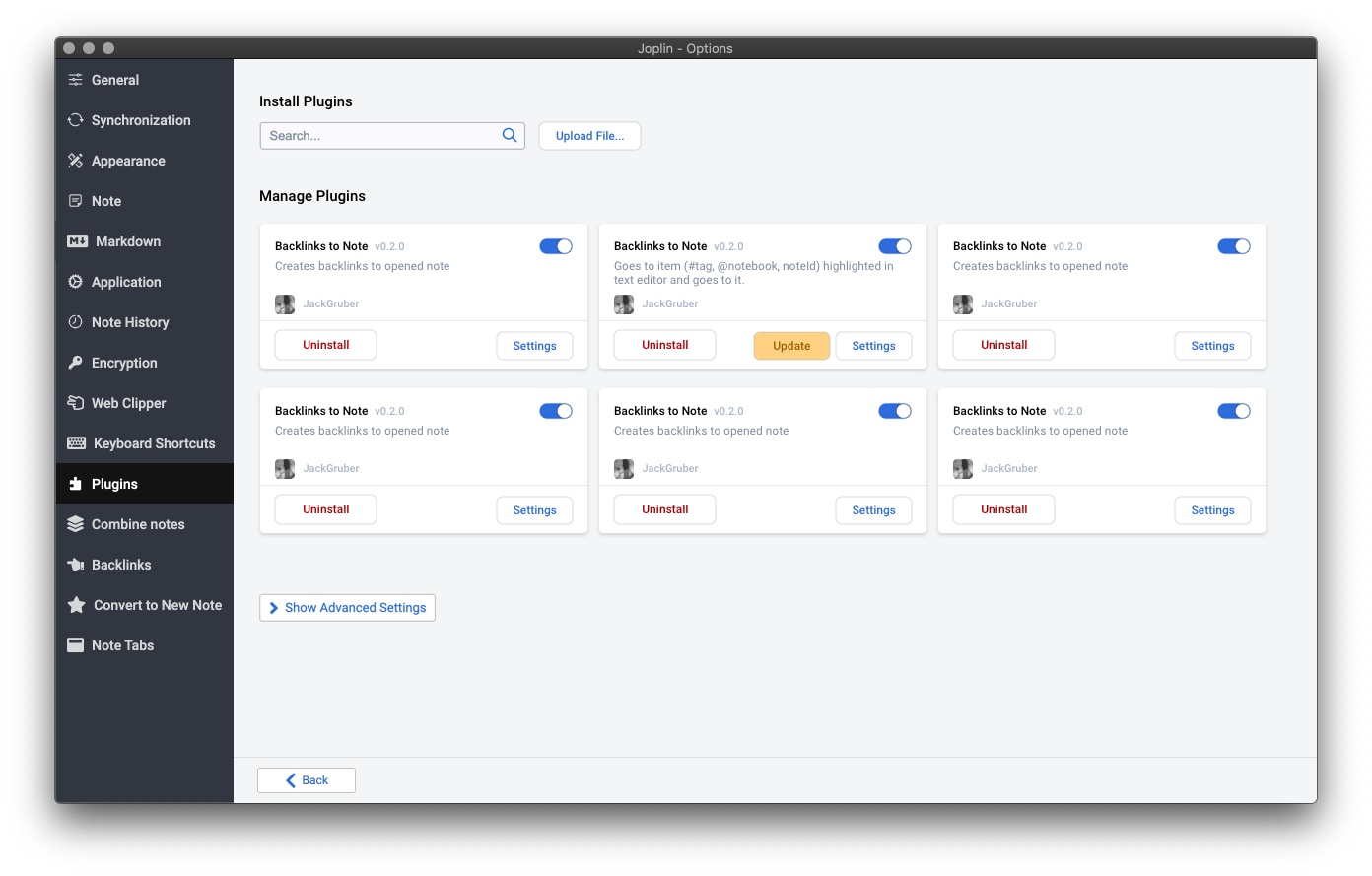
Here's a quick mock of how the cards could work, although as I was doing this, I was thinking about @Daeraxa's comment that these might be better as rows more closely mirroring Atom. I took design direction from there, but tried to keep within the existing Joplin implementation.
I added the author because I like making it explicit that these are 3rd party plugins, buyer beware :-). I also added a link to settings cause now that I have a few, I find it hard to find in the sidebar. I also think the Plugin menu item should be at the bottom of the list, with the plugins in alphabetical order below.
Normal
Searching

7 Likes
Version number is probably the most important (or most used) info for the user.
Since installing is mostly covered by search, info like link to homepage would be needed less and probably used only by someone who wants to suggest or report bug.
So my suggestion would be to show only the Upgrade and Version and show other info in popup triggered by some small icon (like question mark)
1 Like
Thanks for the mockup, that looks very good, and indeed it makes sense to make the boxes larger due to the extra info. Eventually we might have to use rows as suggested by @Daeraxa because I'd also like to put info like number of downloads, updated date, link to homepage, etc. All this is useful info to decide if a plugin is worth installing or not. But for now let's keep it simple.
2 Likes
Could you use a foldable part of the little panels to hide additional information like the uninstall/settings buttons? That allows you to keep all the 'at a glance' info but to hide the plugin specific options until it is clicked which also allows you to put more... stuff in the box without worrying about space too much.
Something should also be done for the Options list in the left panel.
At the moment, plugins are mixed up with the native Joplin options. In my opinion this is not a good idea.
For now there are not many plugins but personally I'm already starting to have trouble distinguishing what belongs to Joplin and what belongs to the plugins, especially if the list of the latter keeps growing.
Some ideas: as suggested by @uxamanda, put the Plugins menu at the bottom of the list and all the plugins below?
Or a drop-down list on the Plugins menu (like for folders)?
Or even a separate page?
What do you think?
1 Like
I guess the easiest would be to have the Joplin sections on top in the sidebar, then a divider, and then the plugin sections below.
Seems like this could use the same CSS styles as the normal left panel? With maybe 'General' as one folder and 'Plugins' as other. In that case you'd need to move the options on the General page itself, but it already seems like that could be combined with "Application". And for Plugins, that page could move to "Manage" in a Plugins folder.
2 Likes
This is looking nice! Thanks for adding the Plugin section, much clearer.
One minor add – can clicking the title go to the github README for the plugin (or whatever the proper website is if they have one)?