I did that ACE Editor css so quickly I did not comment it and I regret that now!
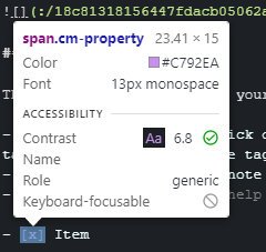
All I did was display the default "Welcome" note and then go through it, changing any elements I found to mimic the ACE Editor. I guess that .cm-property must be in there somewhere!
Well you will be pleased to know that the table above is based almost entirely on 1) the ACE editor CSS you posted and 2) the hint you gave to use the element picker tool.
/* Header 1-4 = red -> orange */
span.cm-header.cm-header-1 {
    color: #FF0000 !important;
    }
span.cm-header.cm-header-2 {
    color: #FF4700 !important
    }
span.cm-header.cm-header-3 {
    color: #FF7000 !important;
    }
span.cm-header.cm-header-4 {
    color: #FF9200 !important;
    }

/*Italics/emphasis = Green*/
span.cm-em {
    color: #1DAA14 !important;
    }

/*Bold = Violet*/
span.cm-strong {
    color: #a386ff !important;
    }

/*BoldItalics = Turquoise*/
span.cm-strong.cm-em{
    color: #40e0d0 !important;
    }

/*BP/NL/L 1 = Cyan (cm-meta controls brackets for L)*/
span.cm-variable-2, span.cm-meta {
    color: #008E89 !important;
    }
/*BP/NL/L 2 = Cyan*/
span.cm-variable-2 {
    color: #00BFB8 !important;
    }
/*BP/NL/L 3 = Cyan*/
span.cm-keyword {
    color: #00FDFF !important;
    }

/*URL = dark blue*/
span.cm-link, span.cm-string.cm-url {
    color: #000AFF !important;
    }

/*Link text = olive*/
span.cm-link-text {
    color: #7B965B !important
    }

/*code = yellow*/
span.cm-comment {
    color: #FFFE00 !important;
    }

/*horizontal line = brown*/
span.cm-hr {
    color: #604A24 !important;
    }

/*Quote 1-3 = light green shades*/
span.cm-quote.cm-quote-1 {
    color: #35bc00
    }
span.cm-quote.cm-quote-2 {
    color: #71d300
    }
span.cm-quote.cm-quote-3 {
    color: #7de900
    }

/*Stikethrough = grey*/
span.cm-strikethrough {
    color: #A1A1A1
    }
2 Likes
jb261
20 January 2021 18:03
224
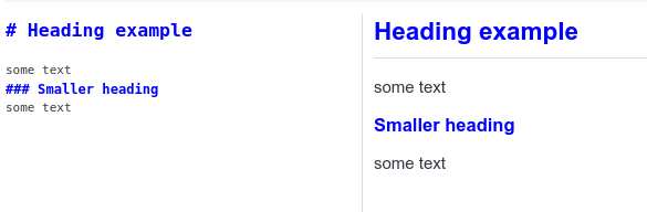
Thanks @dpoulton , switching the editor font and ditching the blue and green defaults in the CodeMirror editor greatly improves readability of my notes in markdown.
Now that I've been introduced to css, there are a number of things I'd like to change! Starting with the ridiculously large header sizes.
Edit: Changed! So much better to have same size headers.
1 Like
ambrt
28 January 2021 11:19
226
Don't know if its been shared already (its a long thread)
/* For styling the rendered Markdown */
h1,h2,h3,h4,h5,h6 {color:blue}
2 Likes
renpj
4 February 2021 06:29
228
Thanks, very nice collection.
dpoulton:
As the div that contains the sync button has no class to use, this asks to not display the second div under the div with the class side-bar .
div.side-bar div:nth-of-type(2) {
    display: none;
}
Just wanted to update that this no longer works. Now the first class has to be div.sidebar
1 Like
is there a way to change the rendered bolt and italic font colors ?
I think you have to use strong and em(emphasis)
tools>options>appearance>show advanced>Custom stylesheet for rendered Markdown
Then add this
/*bold*/
strong {
	color:red;
}

/*italic*/
em {
	color:blue;
}
ines
14 February 2021 10:55
232
Correction: this is for markdown editor colors, not rendered colors, I misread, sorry
For me this works, bold (orange), italics (yellow), strikethrough (teal?), using aritim dark theme otherwise:
span.cm-strong {
  Color: #FF9933 !important
}
span.cm-em {
    color: #FFFF33 !important
}
span.cm-strikethrough {
    Color: #99CCCC !important
}
If I understood correctly, it's important to put this !important at the end to ensure your custom CSS will take precedence?
1 Like
That's for styling the text in the markdown editor, correct? What I posted will style what I think we are calling the rendered markdown.
ines
14 February 2021 12:27
234
Uf, you're right, I completely didn't notice 'rendered' in original question.
I thought 'rendered markdown' is the RIGHT SIDE ; what it looks like when you go PRINT TO PDF as well...
and the other stuff is on the LEFT SIDE ; where you do the actual input typing ; where it forces you to use MONOSPACE.
correct?
ines
14 February 2021 19:54
236
Yup, monospace font is for markdown editor.
I like it really much, but the code blocks use the "sf pro display" font instead of a monospace font.
I fixed that by changing the asterisk to "body", then specify a monospace font to "pre" tag.
I don't think you have to use a mono space font. That's just the default. As well (and you may know this) left and right are changeable using the view>change application layout
Previously Joplin required a monospace font because the editor component couldn't handle proportional fonts. As of sometime last year, Joplin can now handle any font, but it's still recommend to use monospace if you use markdown tables or checklists etc.
1 Like
ok wicked thanks for the clarity guys .
one things I'm trying to figure out with this thread is how to highlight the different components of a notebook;
ie.
Subnotebook
Subsubnotebook etc
have each of them a different background maybe ? anyone have a good way they have their set up . The Default is kind of muted.
@bugsbunny88
This will change the background colours for the nested notebooks.
userchrome.css
.list-item-depth-0 {
	background-color: blue !important;
}
.list-item-depth-1 {
	background-color: green !important;
}
.list-item-depth-2 {
	background-color: red !important;
}
.list-item-depth-3 {
	background-color: purple !important;
}
.list-item-depth-4 {
	background-color: brown !important;
}
And gives you this monstrosity...
Please note that "All notes" is also .list-item-depth-0
3 Likes