I really like that using the old smaller buttons is still an option as some folks seem to prefer them.
However, personally I like the new, larger buttons. Would it be possible to create a setting in the Remoods theme to allow the user to enable or disable the new larger buttons?
Ok, I'll give a try on it later 
Thank you so much! I'm sure a lot of folks will appreciate that!
If you really need new icon, I found now on my device(joplin 2.110.19, ReMoods Theme 4.3.1) have:

but if you let the width shorter:
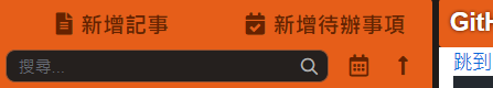
the new big icons are displayed.
p.s. thank you Sinacs, this plugin is so good:)
Thank you @yiyian-Lee! Glad you like to use ReMoods  Feel free to let me know if you have any suggestions to improve the theme.
@joplin_user Yes, as @yiyian-Lee said, you can reduce the panel width to show the big buttons, I didn't strict to small buttons when it's separated into two columns. This is one of the options that you can use the big buttons. But anyway, I will still go with your suggestion.
ReMoods Theme v4.3.3 Updates 2023-06-03
(Latest support Joplin v2.11.6)
- General:
- Fix: Fixed styles missing on Joplin v2.11.6
- Joplin UI:
Is there a way to configure the notebook expander to match the color of the theme? For example, yellow theme with a blue-ish notebook expander icon:
Edit: I am using night mode.
Woops, I think I can't help you with this. This design is for Night Mode only. While you can use custom CSS to change the color, it will affect all other theme modes. Additionally, ReMoods is currently under the testing process of bringing in the HCT color system, so I wouldn't touch any color value at the moment.
Thanks for the reply! Looking forward to the new color system. I will use the Dusk mode until the new color system is released.
Is the color of the icon really that big of an impact? It even makes you avoid using night mode. 
I'm afraid it does currently. I use remoods theme because of the greatly improved UI and color scheme. Unfortunately the non-matching colors look a bit strange to me.
Will the new colors include a gray option as well?
When everything are lower contrast in the night mode, it will be easy to feel boring and sleepy at night if without a bit complementary color. In my thoughts, it is about the function over appearance. But it's fine, I can understand your point, I will keep that in mind anyway. Thanks for the feedback! 
Based on my earlier thoughts, Yes! But the entire concept is incomplete, I was just begin to do research about two weeks, and now considering to make some changes of the HCT colors. I'm not guarantee if it will be sucessfully implemented to the theme.
Very nice! Thank you for donating your work to the world.
I have a question (or suggestion, if it doesn't exist yet). Is there a way to make a visible edge for the different sections? I'm kind of a high-contrast kind of guy and find it difficult to figure out where to put my mouse to adjust the sections.
Actually, I want it to affect all other plugins, too. That was my hope when I asked about it. Visible borders are necessary from a usability standpoint, specifically when the borders have a function, as in this case.
If you don't agree then that's fine. This is your project, not mine. I will figure something else out.

