I believe the plan for the sidebar is to label the levels with different css classes and power users like you can enable highlighting by customizing colours in userchrome.css
That would work…
How do these three buttons work together?
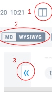
I think it’s:
- Toggles layout modes? or is it an on/off?
- ?
- collapses both of the sidebars at once.
- Toggle code editor layout
- Switch between Rich Text editor and Markdown editor
- Should collapse the sidebars but I don’t think I’ll add this. There’ll just keyboard shortcuts and menu items to toggle the note list and sidebar.
Thanks for the response. It seems to see that the rich text / markdown button only makes sense if you have a single panel editor? Otherwise you'd see both at once anyways? In the mockup, I am not sure what switching to "MD" would do. Seems like it is already in MD mode? Either way, seems like maybe those buttons should be next to each other if they affect each other?
FYI, I've been playing around with structuring this mockup in CSS to see how it could be most easily themed. I hope to have something to share this weekend. Not sure if it'll be useful, but seemed better than trying to describe in words. 
This button is just like the Code View button now - it switches between the Markdown editor and the WYSIWYG editor. The Markdown editor may have two panes but this is unrelated to this particular button.
I'm not sure yet how I'll implement the design - either but just tweaking a bit the existing layout, or if I'll make bigger changes, but indeed feel free to share any idea you might have.
@laurent dude thanks so much for bringing the inverted colors on the note selection. Love it
I liked the more discrete plus for a new note, but can't have it all I guess 
I don’t like either design at all: trendy nonsense that wastes half of the screen of a 13" laptop on white space. Suddenly the laptop becomes just a useless as a phone.
I’d entirely throw away the superfluous note name at the top. The first line in the note is it’s name! (As in Apple Notes.)
And an entire tall line for tags? Wtf?
Just a reminder that Joplin supports customization via the userchrome.css file if the Joplin design offends your sensibilities…
Have to start writing CSS to fix a completely broken design meant for 27" screens, leaving less than 50% of a 13" screen for actual content? Not very user-friendly!
My “sensibilities” don’t care for the aesthetic appearance of the trendy style but that is not the issue: the issue is that it is completely dysfunctional on laptop screens—as seen from the provided screenshots. Absolutely no space for content.
Very good point, just like in this version the sidebars will be resizable (and can be toggled on/off). In terms of vertical height on the notes I think the screen shot is a bit skewed because there appears to be quite a bit of of space lost to header and footer. I imagine it won’t be drastically different from the current design in this regard (it was actually one of the specs of the design to keep things overall similar).
If you still feel like the design needs to be changed please feel free to elaborate about how it can be functionaly improved.
@yadayadaydadaa I use a 13" screen too on my Mac so it’s meant to work in that context too. But your posts sounded more like a rant anyway, and you can use custom CSS if you have very specific needs, or just use Evernote or whatever app has the features you need. Joplin is not meant for everybody, but thankfully there’s a lot of others choices when it comes to note-taking apps.
It seems option A is the clear winner so we’ll go with that, but we’ll also take into account the accessibility concerns that have been raised. In particular it means the contrast will be tweaked a bit so as to achieve a WCAG AA rating. Thanks everyone for participating!